Post 16 lesson plan:
Exploring high contrast images with Keld Helmer-Petersen
|
From Jon Nicholls, Thomas Tallis School
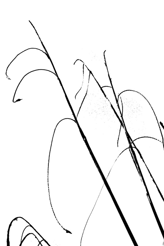
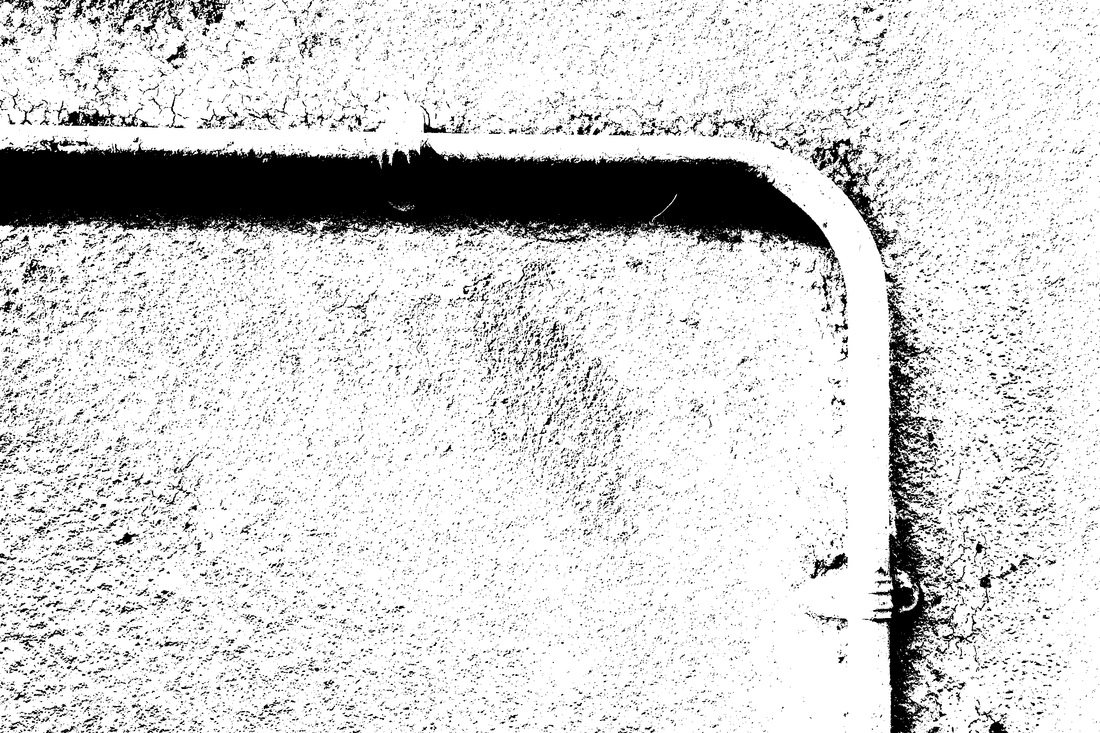
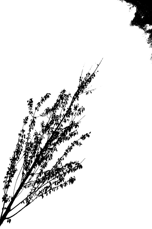
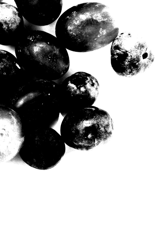
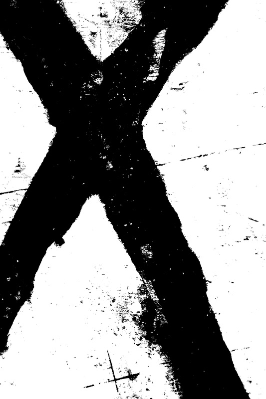
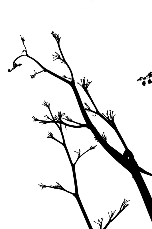
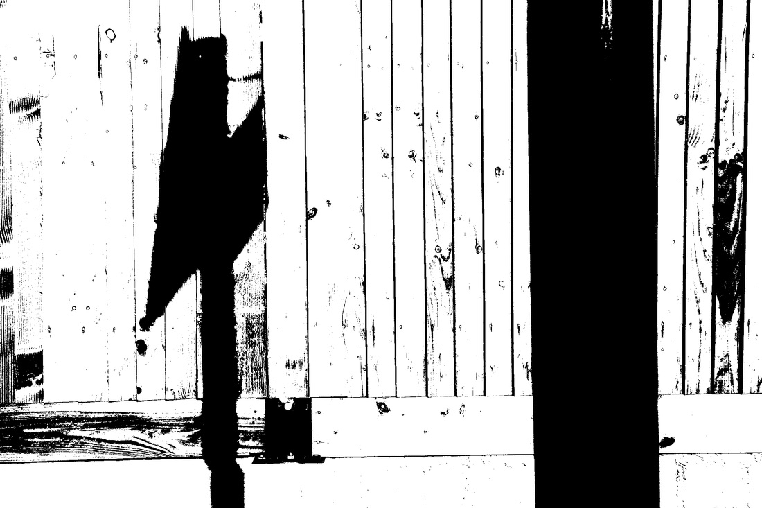
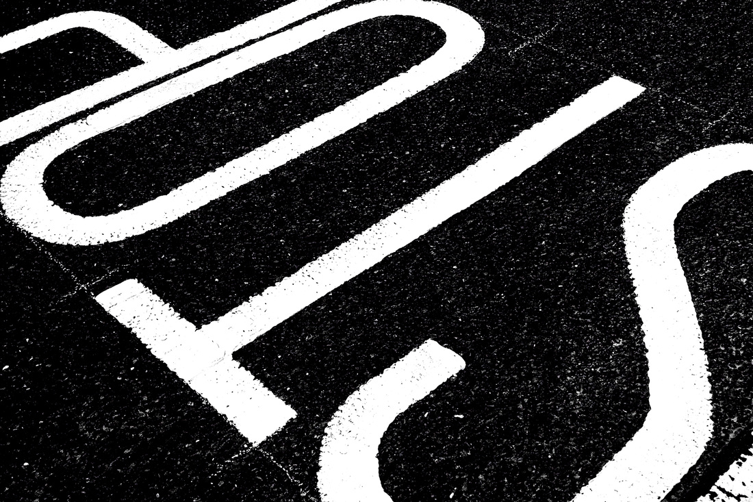
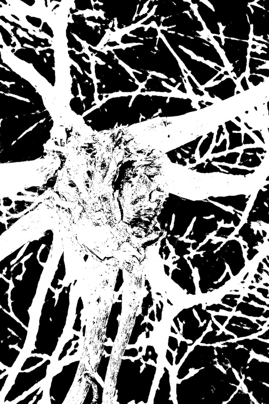
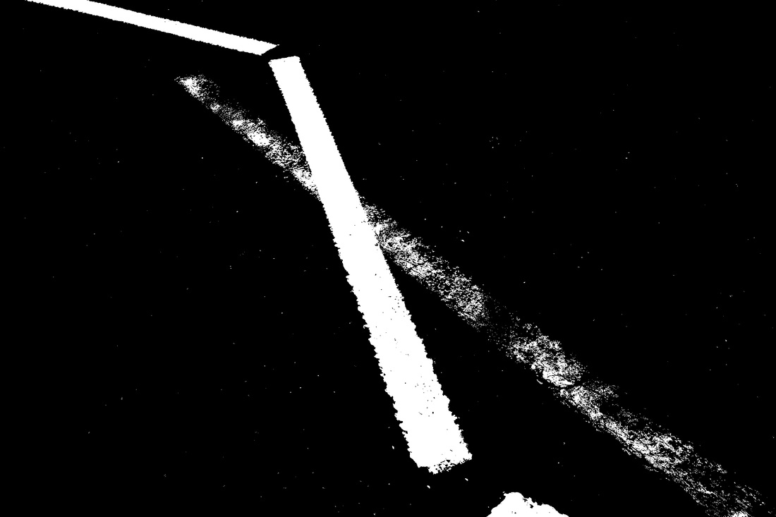
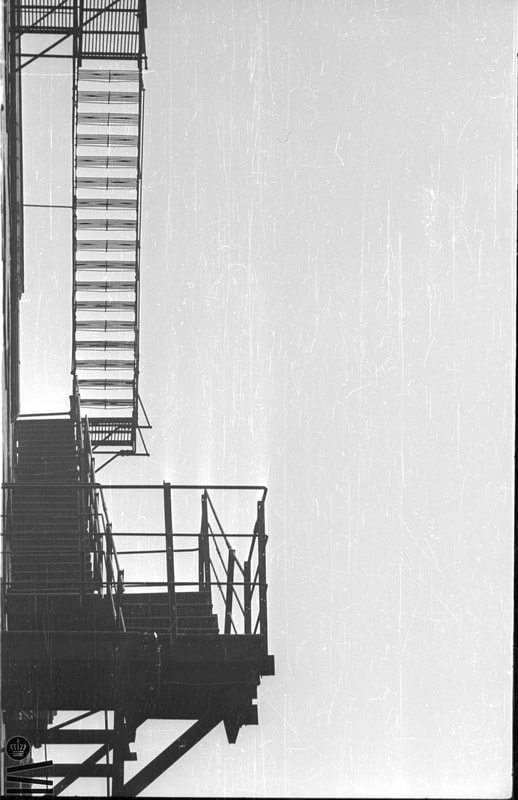
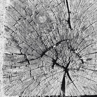
Helmer-Petersen was a Danish photographer who was inspired by Albert Renger-Patzsch, the experiments at The Bauhaus in Germany and by Harry Callahan and Aaron Siskind at the Art Institute of Chicago. He achieved fame for his colour photographs but he also published several books of black and white images that explore dramatic contrasts of tone. In some, we are only presented with images that are black and white. All mid tones have been removed. He created and found these images, using both cameras and flat bed scanners to achieve the effects he was looking for. These books are beautifully designed and encourage us to consider the space around the image and the accompanying text as integral to the meaning of the work.
|

|

|

|


|
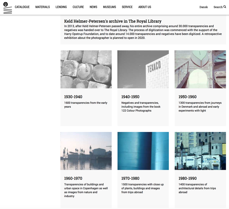
Thanks to the Danish Royal Library, a digital archive of Keld Helmer-Petersen's photographs exists online. It's fascinating to browse through these pioneering images, especially those that were used in the artist's various photobooks.
|
Your task:
|
|
Now, you should:
- Create a new page for your books/websites about Keld Helmer-Petersen.
- Include a selection of images relating to his work with high contrast black and white images (including the books he designed and which feature his work).
- Document the making of your own photo book inspired by Helmer-Petersen and featuring high contrast black and white images. Explain the decisions you made in the creation of the book including the way you crafted and refined the outcome.
- Share what you learned about how to create and manipulate the images for your book and evaluate the final product. What worked well? What could have been even better?
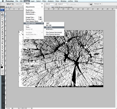
Editing your images
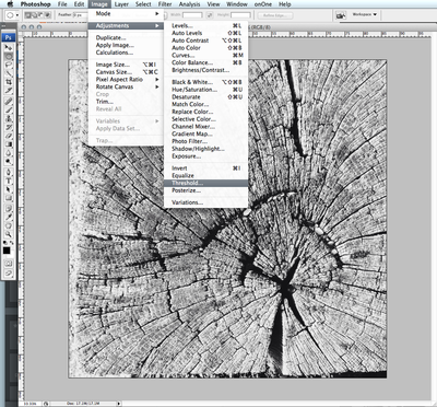
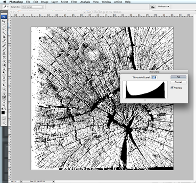
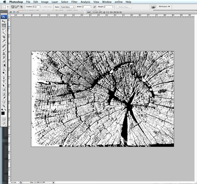
Examples