KS3/4 lesson plan:
An exploration of the illogical, the confusing and the downright absurd with David Shrigley, Erwin Wurm, John Stezaker and others.
-- From Jon Nicholls, Thomas Tallis School and Chris Francis, St. Peter's School
ABSURD
adjective. utterly or obviously senseless, illogical, or untrue;
contrary to all reason or common sense; laughably foolish or false.
noun. the quality or condition of existing in a meaningless and irrational world.
|
The inspiration for this scheme of work was Chris's blog post One project for all classes. Absurd. from September 2014. We have since borrowed this idea for a terms' worth of work with our Year 11 groups at Tallis so what follows is a combined effort.
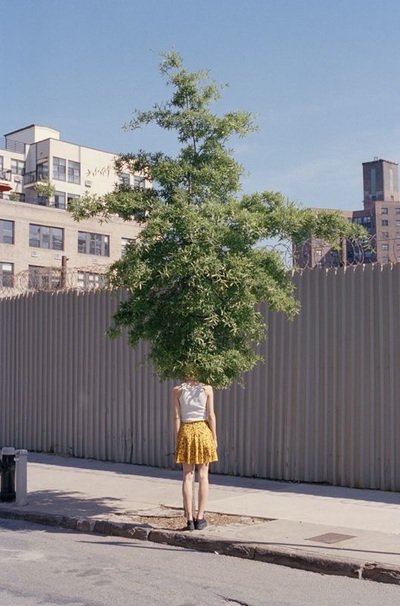
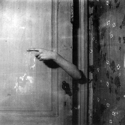
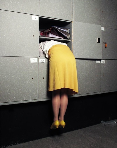
Firstly, why Absurd? The relationship between absurdity and photographic images can be traced back to the Dadaists and Surrealists. For a more detailed exploration of this strand of photography history and its lingering legacy you might wish to check out this A level resource. Suffice to say here that a combination of Dadaist disturbance and Surrealist subversion can be found still alive and kicking in contemporary photography, in documents of performance art and in the world of advertising, which so dominates our image culture. Photoshop and digital imaging technologies have made the relationship between subjects of photographs and the resulting image even more untrustworthy than previously. This gap between the world of things and the photographic 'evidence' has been exploited by many artists and photographers, often with deliberately absurd results.
|
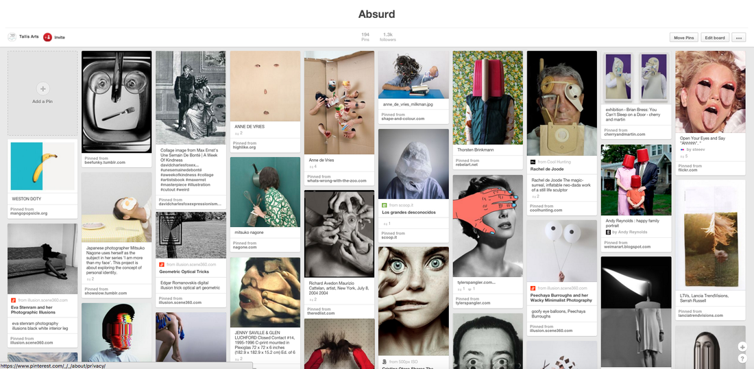
Here's a Pinterest board with a selection of photographic images that could be described as absurd:
As Chris wrote in his original blog post:
We are surrounded by images that, when not of our own making, are delivered relentlessly via 24-hour media. The majority of people rarely stop to question this [...] Studying Photography is a great way to observe, to question, and to respond to the beautiful, confused and complicated world that we live in.
Absurdity is so multifarious that it might seem a bit daunting without a bit of guidance. Here are a few suggestions about how you might want to approach this theme through a series of mini assignments or prompts:
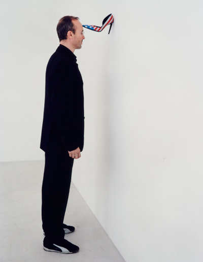
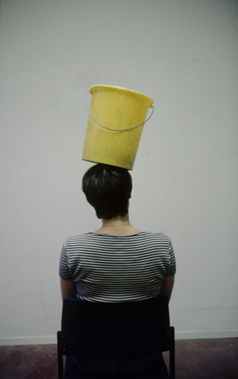
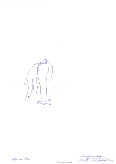
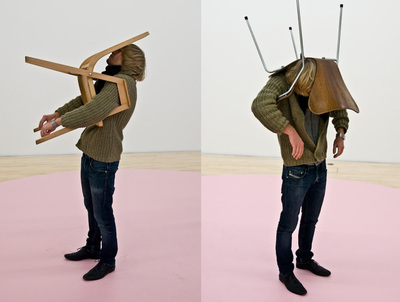
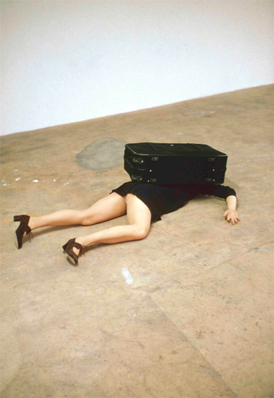
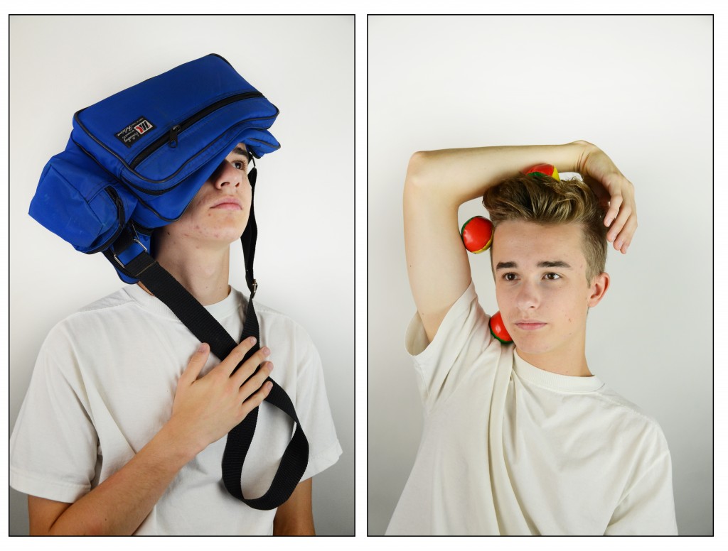
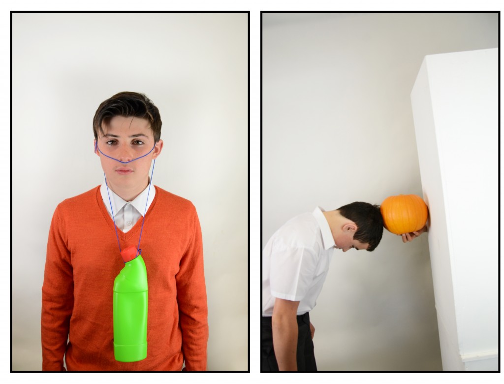
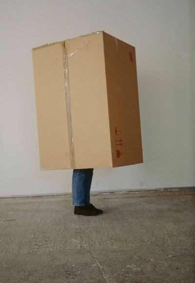
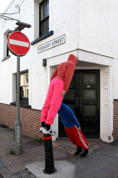
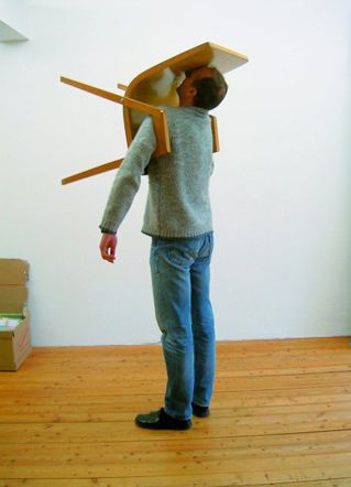
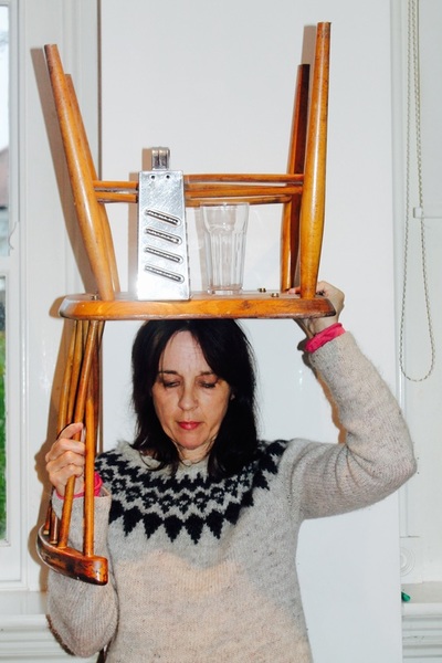
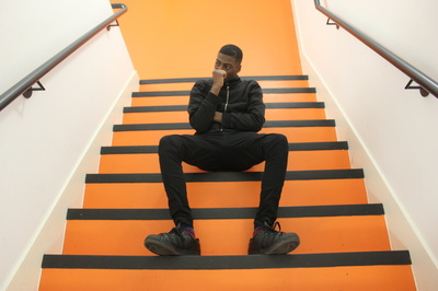
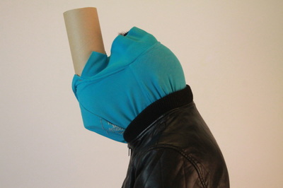
#1: One person, one objectInspired by Erwin Wurm's 'One Minute Sculptures' series, this requires a spot of collaboration and imagination. All you need is a collection of ordinary-ish objects and (possibly) a set of basic instructions. Alternatively, encourage the students to play with their objects and poses with the word 'absurd' in mind.
|
This experiment could be extended by asking students to write and/or draw instructions for each other (as Erwin Wurm does), allowing each other to interpret the instructions in whatever way they think is acceptable.
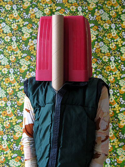
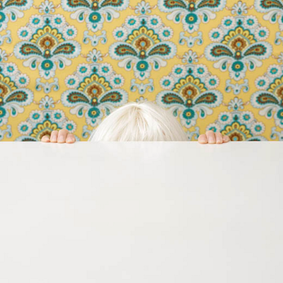
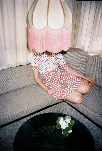
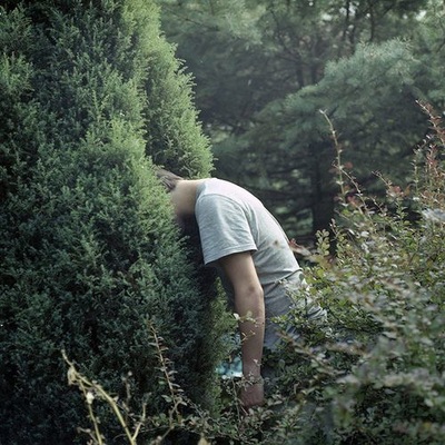
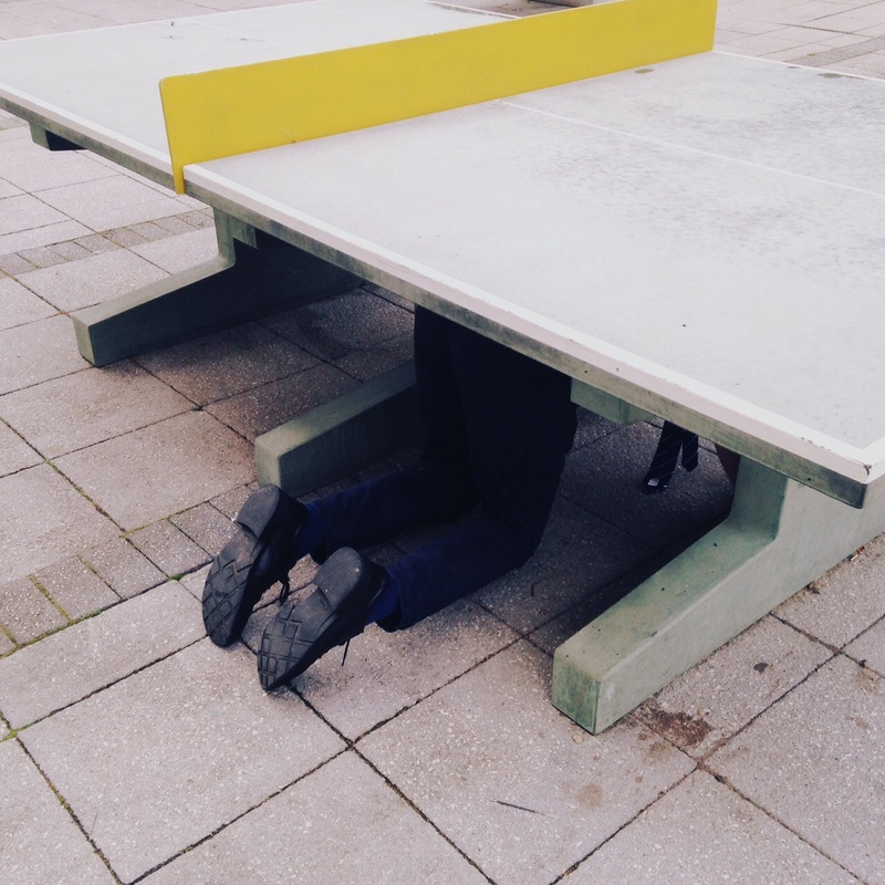
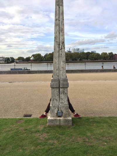
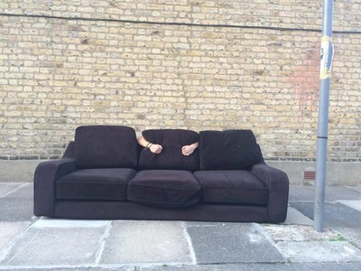
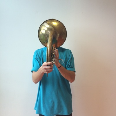
#2: Hide
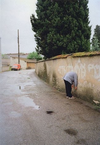
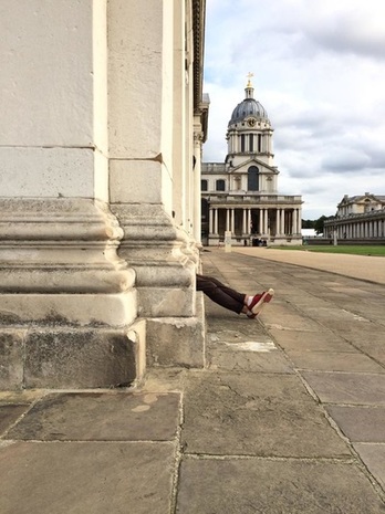
This is another task that hinges on a simple instruction, in this case to create a series of images in response to the word 'hide'. I decided to show the following examples of photographs exploring the notion of hiding after the students returned with their own attempts. We then set about refining and developing our ideas and images. I even had a go myself, asking colleagues to 'hide' whilst I took their portraits on my phone. It certainly provided an amusing interlude.
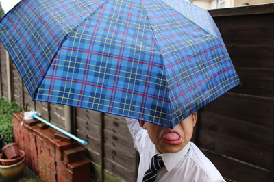
I really like this response by Kristian because he chose great locations and props on his own outside school and understood that the resulting images were only really absurd if the 'hiding' was totally useless:
#3: This is not a sign
|
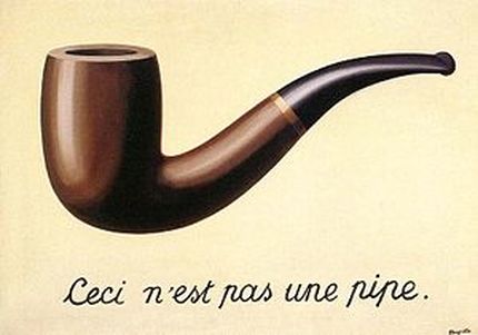
René Magritte, The Treachery of Images, 1948
You could begin this mini assignment with a discussion about this very famous painting of a pipe with the phrase 'This is not a pipe' (in French) written beneath it:
If you're feeling brave you could even share some basic concepts related to semiotics. This video is pretty helpful. |
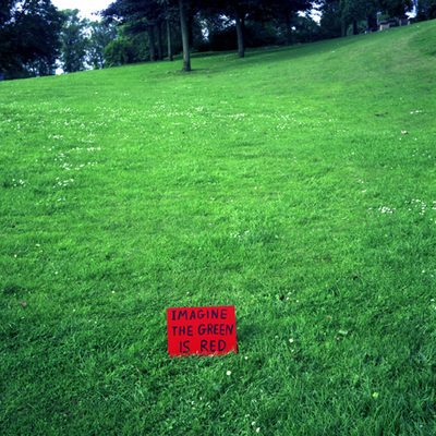
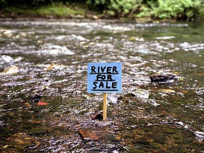
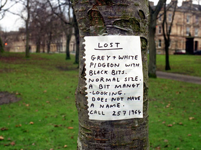
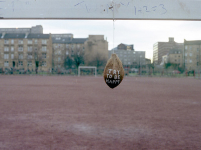
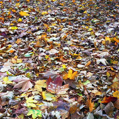
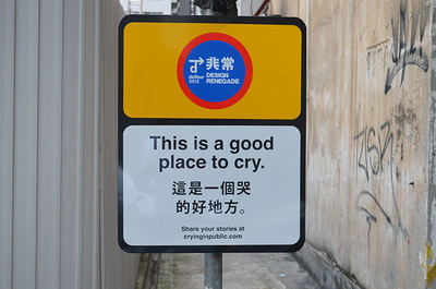
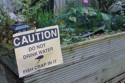
Signs are meant to help us. They can warn us, instruct us, direct us, support us, inform us. What happens when signs do the opposite of these things? Some photographers and artists have played with the conventions of signs, the accepted ways in which we expect signs to work. This often results in absurd images. Here are some examples by the artist David Shrigley:
- Try to explain what makes these photographs absurd?
- What do you think when you look at these signs? Are they helpful?
- Why do you think the artist has placed the signs in public places? Who are the signs for?
- Why was it important to take a photograph of the signs?
Schools are full of signs, usually instructing young people to do (or not do) various things. Ask students to list the types of signs they know about in school. You could extend this to signs in their neighbourhood. Think about how signs look, how words are used in conjunction with shapes and colours and how the various combinations communicate different things.
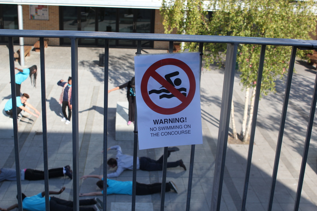
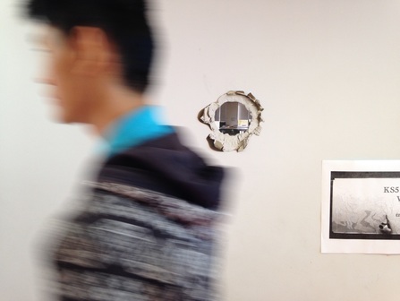
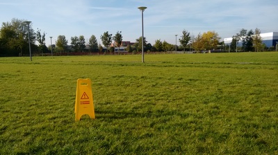
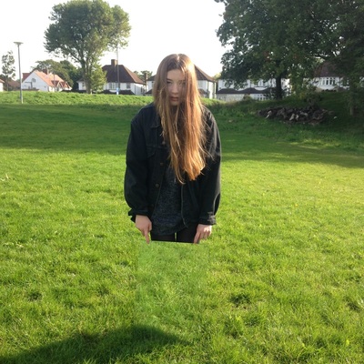
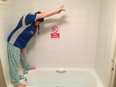
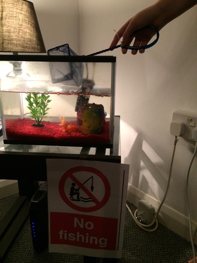
Now, experiment with creating, placing and photographing new signs that are deliberately absurd. These designs should undermine the usual purposes of signs whilst imitating the way they are constructed. Here are a couple of my favourite responses created by Peter and David, Year 11 students at Tallis. Peter persuaded the class and me to pretend to swim (illegally) on the concourse. That's me doing a less than impressive front crawl. David's photograph of an imaginary hole in the wall (photos are types of sign after all) is so convincing (showing a view through the wall to the classroom behind) that several members of the site staff have been known to stop in their tracks at the sight of it:
Now, experiment with creating, placing and photographing new signs that are deliberately absurd. These designs should undermine the usual purposes of signs whilst imitating the way they are constructed. Here are a couple of my favourite responses created by Peter and David, Year 11 students at Tallis. Peter persuaded the class and me to pretend to swim (illegally) on the concourse. That's me doing a less than impressive front crawl. David's photograph of an imaginary hole in the wall (photos are types of sign after all) is so convincing (showing a view through the wall to the classroom behind) that several members of the site staff have been known to stop in their tracks at the sight of it:
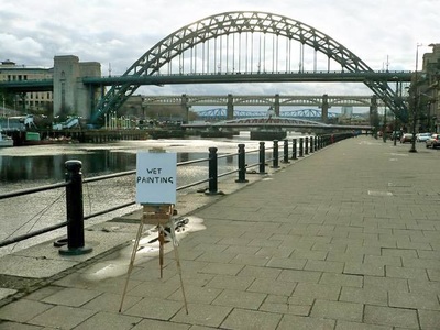
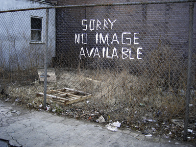
Here are some more examples of sign based absurdity by other artists. This blog has lots of great examples:
Here are a few more ideas:
- Add signs to things that don't need signs e.g. pencil, classroom, window etc.
- Add the wrong sign to things that have an already obvious function e.g. adding the phrase 'Gateway to secret parallel universe' to a toilet door.
- Write poetic messages on Post It notes and leaving them in unlikely places
- Create official looking signs that don't make sense (Tip: these need to look believable)
- Give people bizarre and/or impossible instructions e.g. Don't look at this sign
- Make signs from odd song lyrics e.g. “What about elephants? Have we lost their trust?” (Michael Jackson)
#4: Sleeping on the job
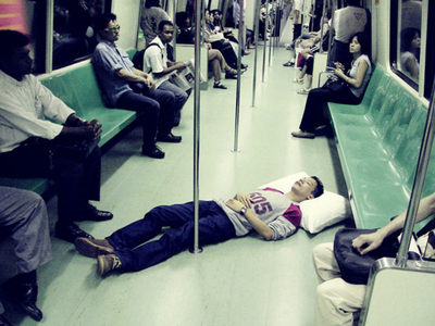
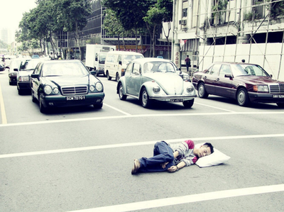
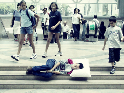
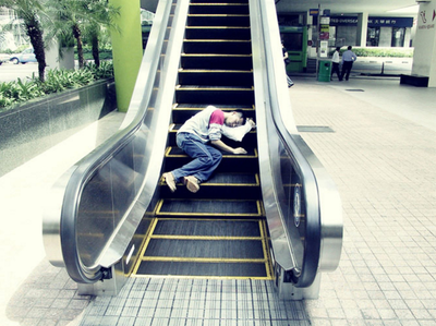
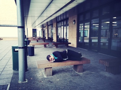
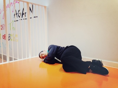
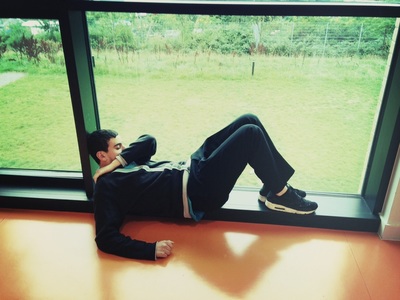
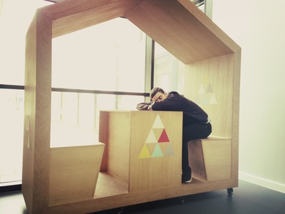
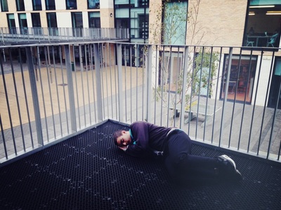
This prompt is inspired by a series of photographs entitled Beon Sleeps by John Clang.
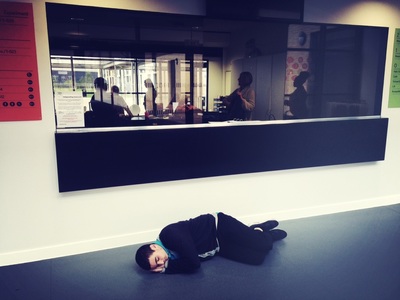
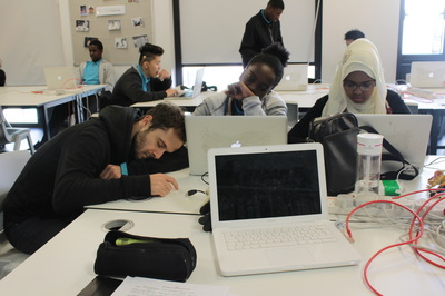
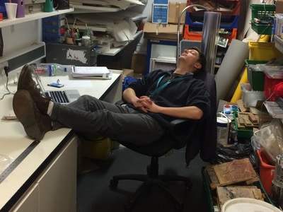
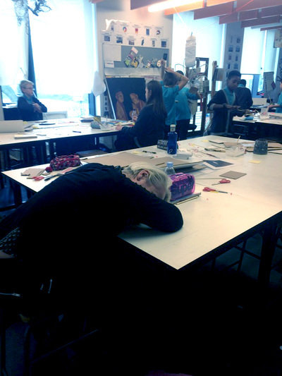
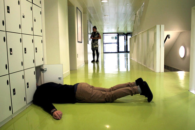
The idea is simple. Take a series of images in which you (or a friend/classmate) is shown sleeping in unusual locations. Here is a great set of photos taken by Kemal at Thomas Tallis School:
Kemal has developed this idea by asking members of staff to pretend to be asleep in their offices and classrooms. This required an additional amount of planning, permissions and diplomacy but has led to some interesting and absurd results:
#5: Forced Perspective
|
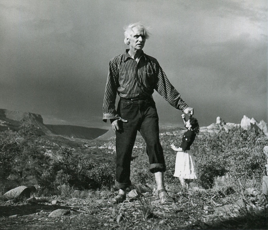
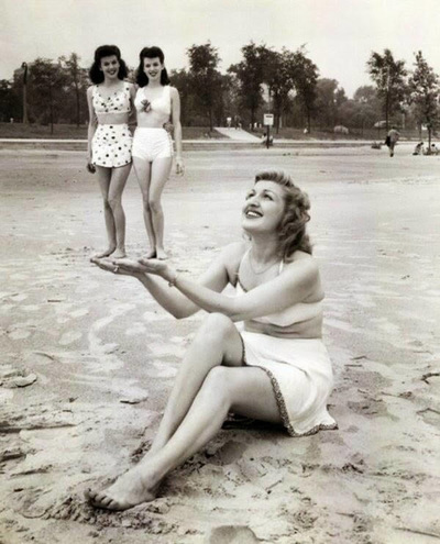
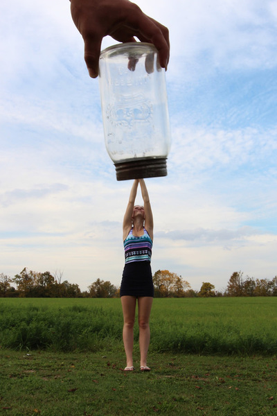
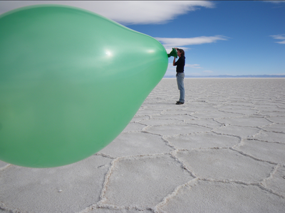
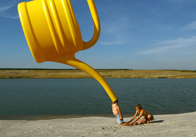
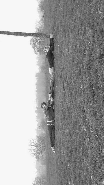
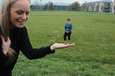
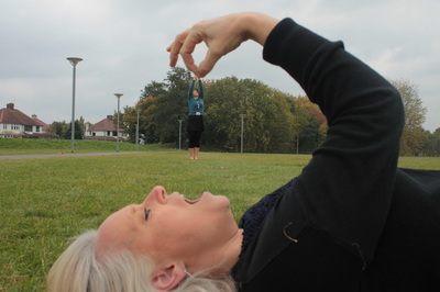
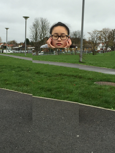
One of the strangest things about photographs is that they flatten space. Objects that can be distant in reality can appear to be right next to each other in a photograph. This is sometimes referred to as Forced Perspective - the photographer is altering our normal sense of space (foreground, middle ground and background) by forcing objects that don't belong together to be directly in relation to one another. The photograph on the left is a famous image of artists Max Ernst and Dorothea Tanning taken by the equally famous photographer Lee Miller. It's a joke about the relative reputations of male and female artists. Tanning is standing in the background, Ernst in the foreground, but it looks as if he is holding her down. This kind of optical illusion is a consequence of the way that photographs can alter our sense of space and perspective. They flatten the world into two dimensions. |
|
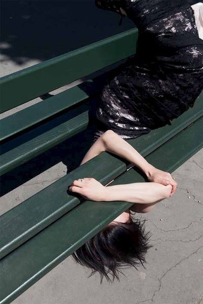
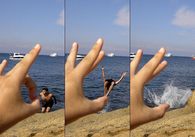
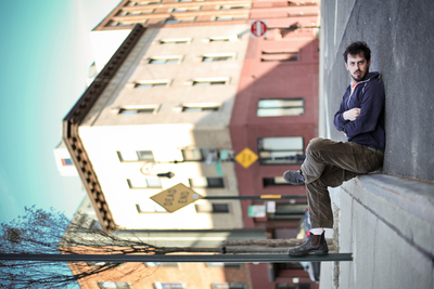
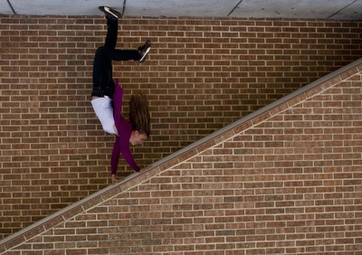
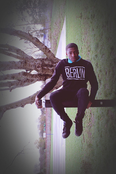
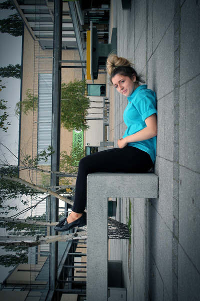
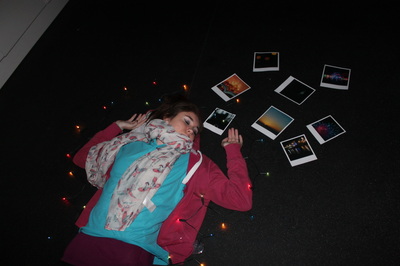
Michael Hughes creates this kind of optical illusion in his photographs which feature small objects (souvenirs of his travels) that stand in for much larger, famous objects and landmarks. Photographers also play with rotating their photographs, changing our sense of proper orientation. Our expectations of up and down can be radically altered so that people lying on the floor can appear to be sitting, flying or stopping themselves from falling.
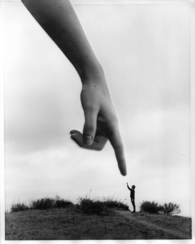
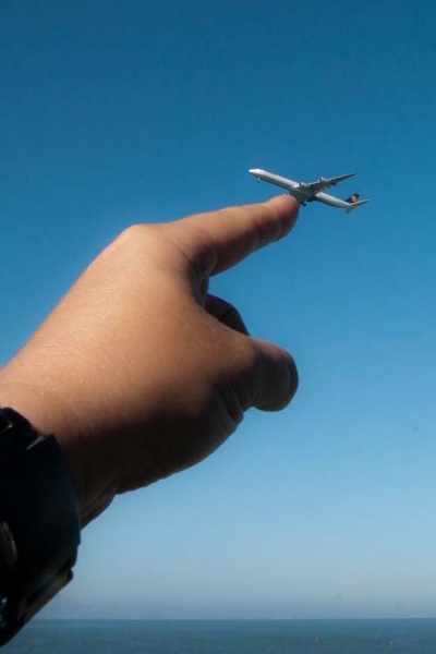
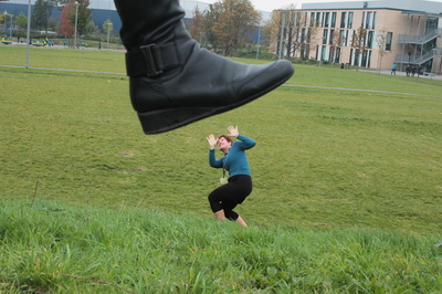
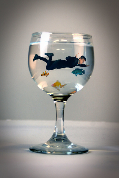
Such images are absurd because our eyes and brain try to make sense of something we know can't be true. Here are some other examples. They illustrate two techniques:
|
Father Ted explains to Dougal the difference between "small" and "far away".
|
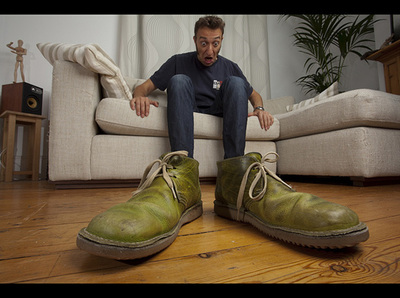
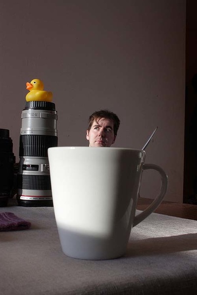
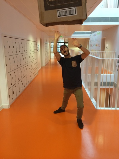
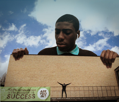
Here are some responses by Tallis students:
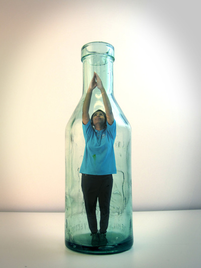
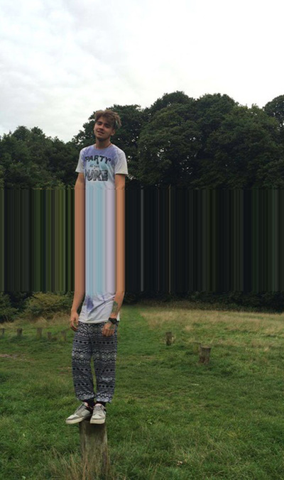
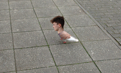
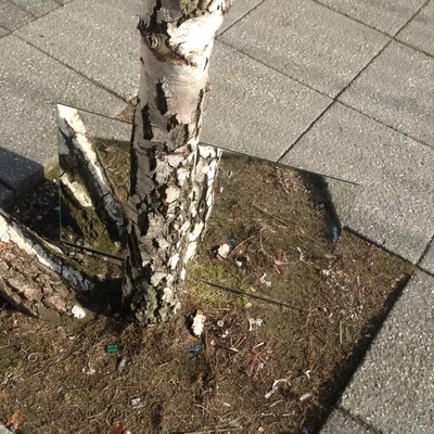
This effect can be created in camera (paying careful attention to aperture settings so that both the near and far subject remain in focus), or using software like Photoshop. Here are a couple of student examples which are the result of more deliberate planning and the use of separate images which are combined digitally:
#6: Multiple Portraits
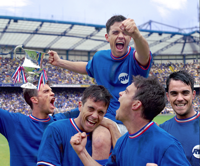
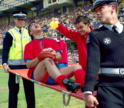
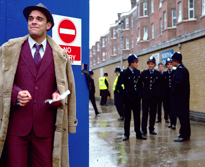
This assignment is inspired by the visual antics of artist Paul M Smith. He is famous for creating group portraits in which he (o in one famous case Robbie Williams) features as all the subjects. here are some images from the sequence that was used by the pop star for one of his albums:
|
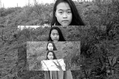
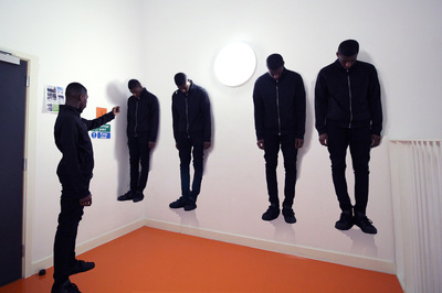
Although this requires some planning (it's easier to achieve if there are no overlapping bodies and you need a tripod to ensure all the photographs line up exactly), once you've imported the photographs to a layers based editing programme like Photoshop, it's relatively straightforward to construct the final image. Here's an example made by Tommy in Year 11:
|
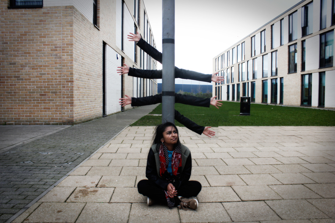
Nazmin developed this idea and produced an even more surreal outcome:
Some other possible approaches:
Here are a few more possible starting points, although your students will inevitably have great ideas of their own once they are given license to play. I've found that this has been a great project to do in Year 11, partly as an antidote to the intensity and pressures experienced by students across the curriculum in the lead-up top their exams. It's always nice to have a reason to mess about, indulge in what Chris likes to call "creative mischief" and be inventive. Nevertheless, playing visual games is a serious business and really exercises the students' imaginations:
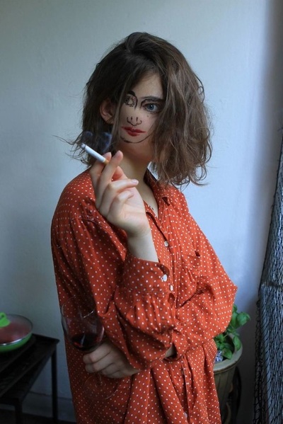
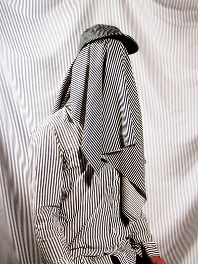
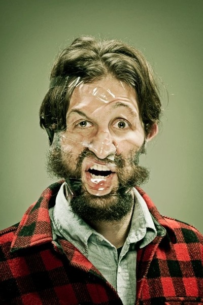
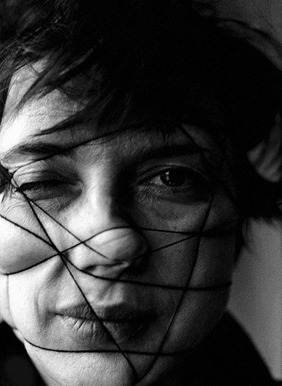
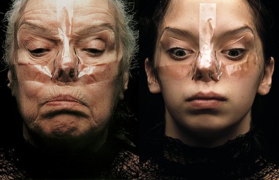
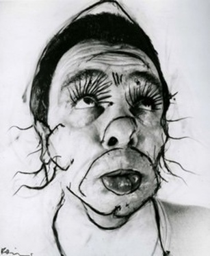
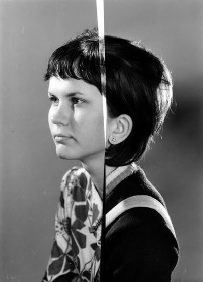
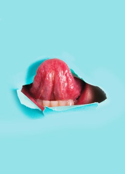
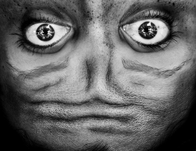
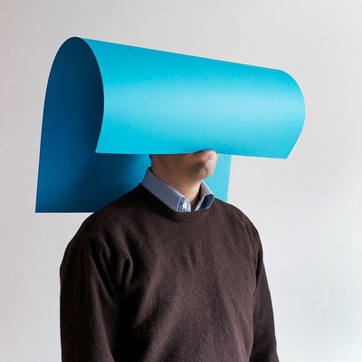
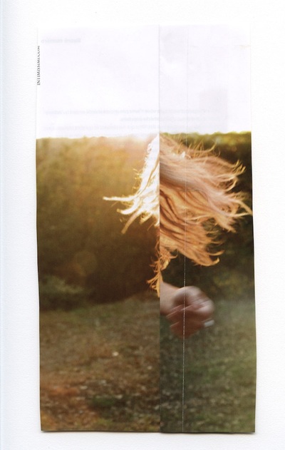
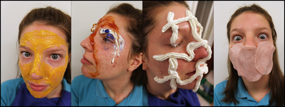
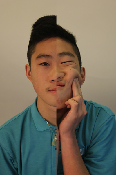
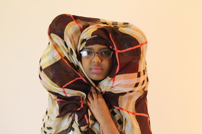
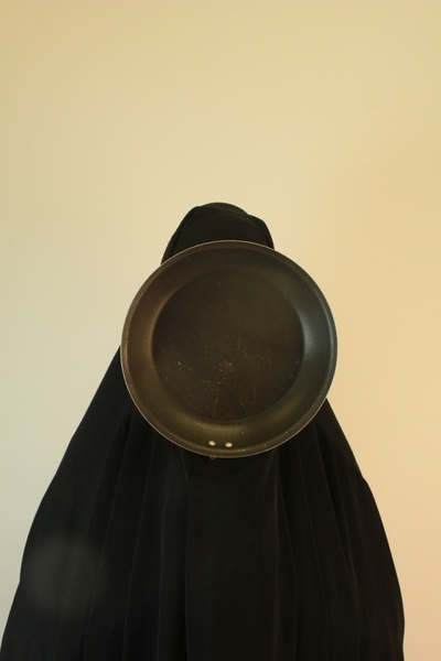
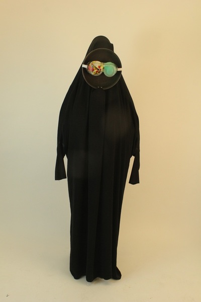
The human face is comprised of instantly recognisable features arranged in a particular way. Some artists/photographers have attempted to re-arrange or distort these features either directly (using a range of materials) or by altering the surface of the photograph itself.
|
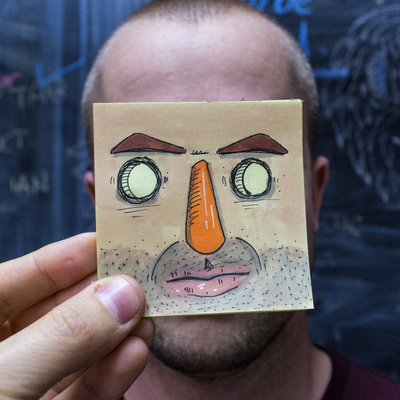
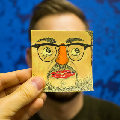
The simple Post It note can be a great way to experiment with disguised portraits.
|
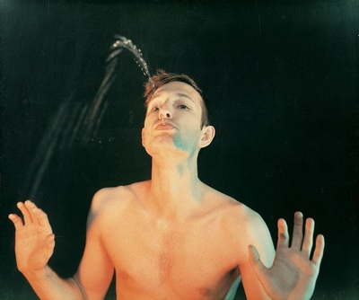
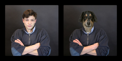
Some artists, for different reasons, have explored the way our brains make sense of the impossible.
|
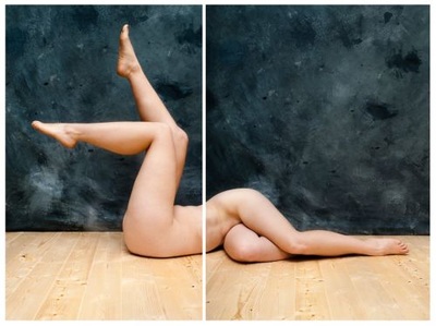
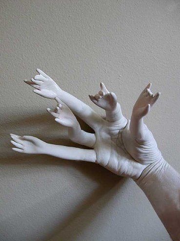
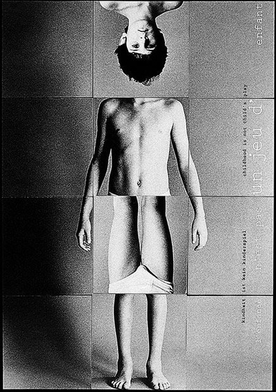
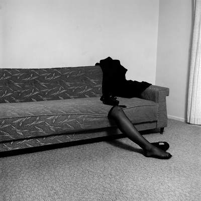
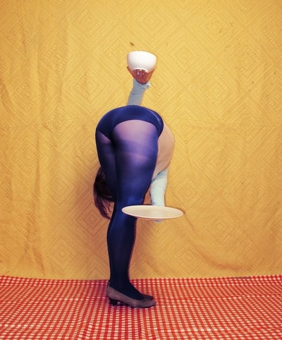
As with the human face, the body's various constituent parts can be re-arranged, combined, repeated, isolated or dismembered photographically in a variety of ways for comic or disturbing effect.
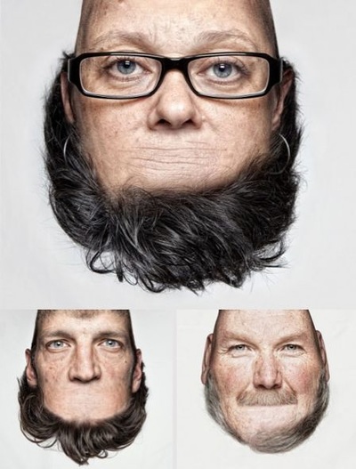
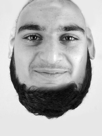
A seemingly simple reorientation (through 180 degrees) of the whole or part of a human face is a strategy used by some artists. Our brains are confused but work very hard to make sense of the information. The central image by Blommers & Schumm takes advantage of this ability with surprising results (Note: rotate the upside down portrait above to see for yourself).
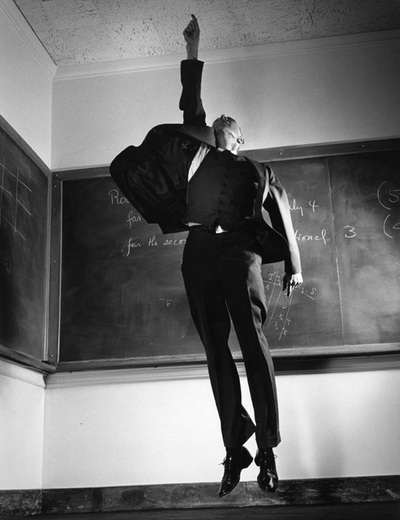
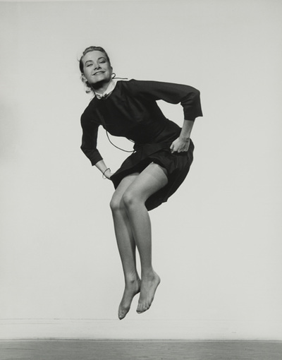
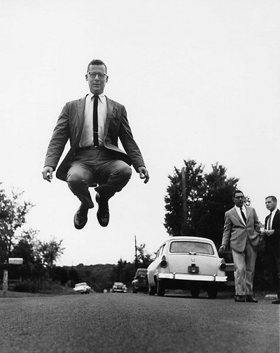
This famous series of portraits shows how a simple instruction, "Jump", can disarm the sitter and produce an element of absurdity. Of course, the level of absurdity is increased if the subject of the portrait is usually quite a serious person - a teacher, for example.
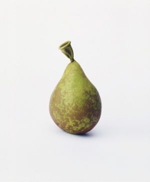
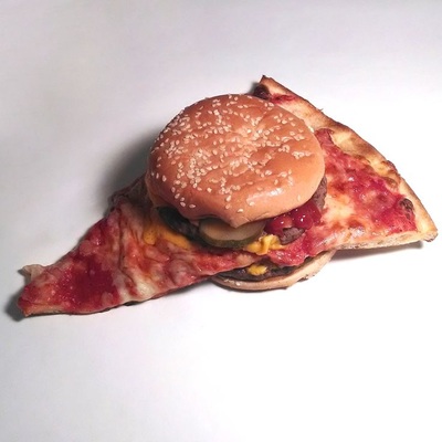
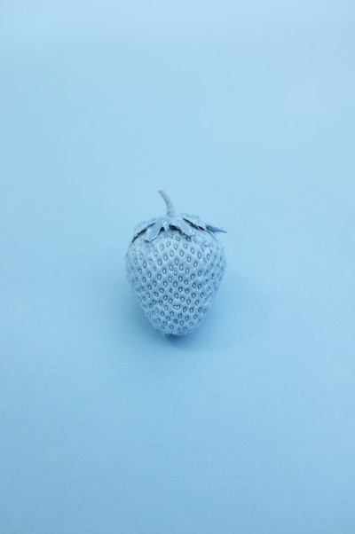
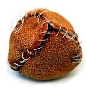
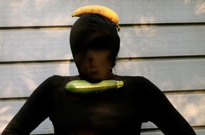
Food is a great material for playful manipulation. Colour, texture, shape, size etc. can all be altered. Digital alterations can draw attention to the similarities between fruit and other objects. The appropriate can be made inappropriate. Fruit, like a body, has a skin.
What happens when the human body is treated as if it was an element in a sculptural form? The ability of photography to freeze the form is crucial here (making a short performance permanent) along with traditional sculptural issues of outline, arrangement, balance, pose, weight etc.
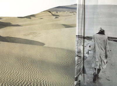
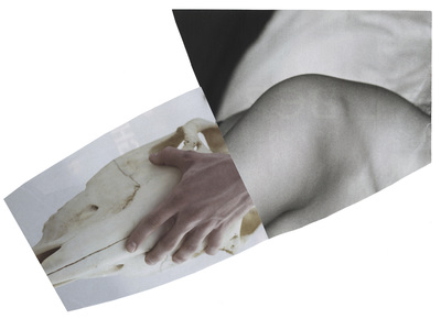
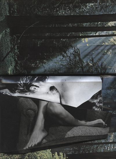
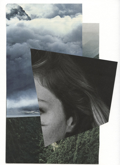
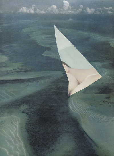
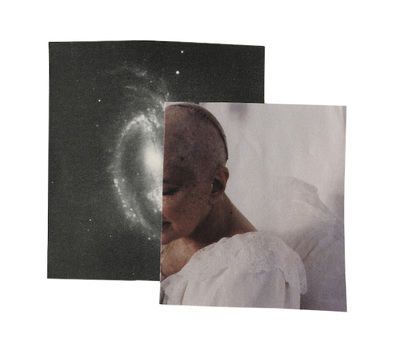
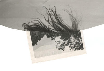
Serrah Russell's disarmingly simple collages juxtapose two (or more) separate elements, creating a surprising, charming and absurd visual link. This process requires a combination of imagination, visual literacy, playfulness and wit and is harder than it looks.
What a
|
|
|
Since the Dadaists' performances at the Cabaret Voltaire in Zurich, artists have explored various absurd scenarios in their work. There are many examples, especially now that performance art is a genre in its own right. The examples above are based on the transformation of ordinary activities like walking, sitting, climbing, standing. They remind us how quickly the ordinary can become absurd through exaggeration and documentation.
What other absurd ideas can you think of...?
Photographs by Year 11 students at Thomas Tallis School.

