
|

Each Threshold Concept has a supporting image inspired by our Photopedagogy camera. TC #8 shows a book - a dictionary, reference text or creative manual perhaps - with a shutter button marking a key page.
Threshold Concept #8Photographs consist of formal and visual elements and have their own ‘grammar’. These formal and visual elements (such as line, shape, repetition, rhythm, balance etc.) are shared with other works of art. But photographs also have a specific grammar - flatness, frame, time, focus etc. ‘Mistakes’ in photography are often associated with (breaking) the ‘rules’ and expectations of this grammar e.g. out of focus, subject cropped, blur etc. Some photographers enjoy making beautiful images but others are more critical of what beauty means in today's world.
Photographers have to impose order, bring structure to what they photograph. It is inevitable. A photograph without structure is like a sentence without grammar—it is incomprehensible, even inconceivable. |
An almost obsessional interest in the formal properties of photographs is characteristic of the early to mid twentieth century - what we sometimes refer to as Modernism or Formalism. This way of thinking about photographs has come to seem a bit old fashioned due to competing theories of photographic meaning, Postmodernism and digital culture. It is certainly true that formalist readings of photographs alone can never do full justice to the complex webs of meaning generated by photographic images. As we discovered in TC#7, photographs aren't neutral. They don't show us things as they are, although they're pretty good at pretending they do. Photographs are ideological constructs, a fancy way of saying that they don't simply show us what is 'true' or 'real'. However, one might argue that photo literacy in part depends on an understanding of the formal or visual elements, some of which are borrowed from the visual arts, with others appearing to be specific to photography. As in any language, 'grammar' gets you so far, helps you appreciate the structure and 'rules' governing particular modes of expression. A knowledge of the 'grammar' of photography is therefore part of the analytical and creative toolkit of any photography student.
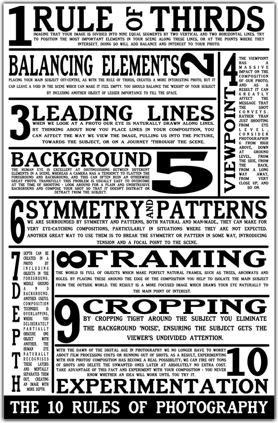
The Formal or Visual Elements
Photographers are usually aware of the ways in which they can create interest in their images regardless of the subject. This is sometimes what separates successful and less successful pictures of the same thing. The following list describes some of the formal or visual elements in any photograph. These are mostly shared with other kinds of pictures, although photography has some that are special:
|
Light:
Line: Repetition: Shape: Space: Texture: Value/Tone: Colour: Composition: |
Which areas of the photograph are brightest? Are there any shadows? Does the photograph allow you to guess the time of day? Is the light natural or artificial? Harsh or soft? Reflected or direct? How does light fall across the objects in the photograph?
Are there objects in the photograph that act as lines? Are they straight, curvy, thin, thick? Do the lines create direction in the photograph? Do they outline? Do the lines show movement or energy? Are there any objects, shapes or lines which repeat and create a rhythm or pattern? Do you see echoes or reflections within the image? Do you see geometric (straight edged) or organic (curvy) shapes? Which are they and how do they relate to each other? Is there depth to the photograph or does it seem shallow? What creates this appearance? What is placed in the foreground, middle ground and background? Are there important negative (empty) spaces in addition to positive (solid) spaces? If you could touch the surface of the photograph how would it feel? How do the objects in the picture look like they would feel? Is there a range of tones from dark to light? Where is the darkest part of the image? Where is the lightest? Are the tones in the photograph balanced or does the image tend towards darkness or lightness overall. How does this affect the mood or atmosphere? What kind of colours can you see e.g. saturated, muted, complementary, primary? Is there a dominant colour? How would this image be different if it was in black and white? Does the use of colour help us understand the subject or does it work independently? How have the various elements in the picture been arranged? Does the image seem balanced or unbalanced? Is it possible to superimpose geometrical shapes on the image to better understand the composition e.g. a pyramid? Has the photographer used the Rule of Thirds? |
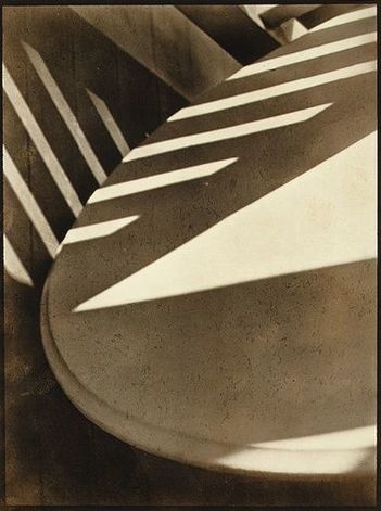
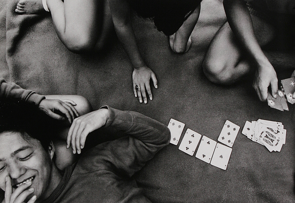
The photograph below is by Paul Strand. It is entitled 'Abstraction, Twin Lakes, Connecticut' and was made in 1916. You can read more about the image here. The photographer created a picture that draws attention to the Formal Elements. Spending some time really exploring photographs in terms of the formal elements is an important process in the development of visual literacy.
|
Light: A triangular slash of bright sunlight appears in the middle of the image. This is accompanied by bands of light running diagonally across the upper portion of the image. These appear to be gaps in another object out of shot, a fence perhaps. Line & Shape: There are number of strong lines, mostly straight, although these are complemented by the sweeping curve of the main object which runs from the top right of the image to the bottom right. All of the lines have the geometric quality of man made objects. Repetition: The shafts of sunlight running across two surfaces create a dramatic rhythm. A number of straight parallel lines punctuate the composition, like repeated notes or beats in a piece of music. Space: The space in the image appears quite shallow, tightly constrained by the framing. We don't see the whole of any of the objects and the photographer appears to have been quite close to the subject. Texture: All of the objects in the image appear smooth. The drama comes from the jagged bursts of light across their surfaces. Value/Tone: The image contains a range of tones from very dark to very light. There are deep shadows but also mid tones. The photograph is monochrome but has a brownish tint, perhaps caused by the paper the artist has used. Composition: A sense of drama is created by the diagonal lines and the objects seeming to tilt towards the bottom left of the picture. |
This presentation attempts to introduce students to some of the ways in which the compositions of various photographs can be understood.
Suggested activity:
- Print a variety of photographic images and encourage students to draw lines on them indicating the ways in which compositions have been organised.
- Using a different set of images, ask students to make quick sketches (1-2 mins) indicating the compositions. The aim of this exercise is not to create a copy of the photograph but to quickly identify the way the photographer has organised various elements like space, line, shape and form into an overall composition.
- Practice this way of looking repeatedly, with each new set of images explored in class, so that it becomes almost second nature.
Note: Experienced photographers may not compose their shots thinking explicitly about compositional devices or Formal Elements. These ways of seeing are often instinctive and the result of deliberate practice. Knowing about them is just the first step in understanding why some pictures may 'work' better than others.
The 'grammar' of photographs
|
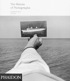
The distinction between formal elements shared by most visual images and the specific 'grammar' of photography is asserted by Stephen Shore in his wonderful book The Nature of Photographs. With a comparison between painting and photography we encountered in TC#4, Shore explains:
Photography is inherently an analytic discipline. Where a painter starts with a blank canvas and builds a picture, a photographer starts with the messiness of the world and selects a picture [...] He or she imposes this order by choosing a vantage point, choosing a frame, choosing a moment of exposure, and by selecting a plane of focus. This is what Shore refers to as the Depictive Level of the photograph. Hence, he defines four ways in which the world is transformed by the camera into a photograph: flatness, frame, time and focus.
|
|
These four attributes define the picture's depictive content and structure. They form the basis of a photography's visual grammar. They are responsible for a snapshooter's 'mistakes': a blur, a beheading, a jumble, an awkward moment. They are the means by which photographers express their sense of the world, give structure to their perceptions and articulation to their meanings.
Flatness: photographs are two dimensional. The three dimensional world is projected onto this flat surface. Things separate in the world can be brought into relationship when flattened (TC5)
Frame: photographs, unlike the world, have edges. The content of the photograph is contained by and relates to the surrounding edges. (TC4)
Time: the flow of time in the world is interrupted by the photograph. A photograph contains a 'parcel of time' that has cut across the grain of life. (TC10)
Focus: a photograph contains a plane of focus that can be shallow or deep. Focus can help to draw attention to the subject of the photograph as distinct from its content.
Suggested activities:
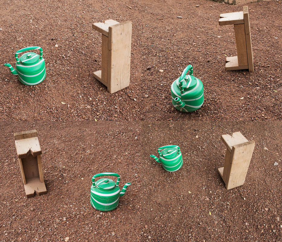
- Provide a range of photographic images (some are included below) for students to analyse in terms of the Formal or Visual Elements. This is often best done in small groups. Each photograph can be stuck in the middle of a large sheet of paper and Element headings placed around it. The group can then collectively interrogate the picture, annotating as they go. Groups could also rotate around the room, adding to the annotations of the previous groups.
- Once the class has had some practice analysing photographs in groups, give each individual student an image to interrogate again using the Elements headings.
- Briefly explain Stephen Shore's concept of the 'grammar' of photographs. What so we understand by the notion of grammar in terms of languages? In what sense could photographs be said to have a 'grammar'?
- Select a range of photographs and ask students to analyse them in terms of flatness, frame, time and focus.


Practice makes perfect
Digital cameras are so sophisticated that they can remove the need to understand and control the way the world is represented. The more students grasp the connection between the camera's settings and the resulting images, the more they are able to choose how their photographs look. Flatness, Time, Frame and Focus are determined by technical as well as aesthetic decisions.
|
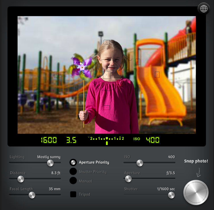
Camera simulationUnderstanding the relationship between the settings on your camera and the effect these choices will have on the resulting photograph takes time and practice. Using a camera simulator is a fun way for individual students to experiment and for teachers to demonstrate without the need for class sets of DSLRs!
Depth of FieldDepth of Field (sometimes referred to as DoF) is crucial to the 'grammar' of photography. How much of the image is in focus is determined by the relationship between the various settings you choose on your camera. For example, using the simulator, ask students to experiment in Aperture Priority mode, moving the Aperture slider from left to right (from relatively wide to smaller aperture settings). What happens to the other settings? What happens to the images?
Once students have grasped this basic relationship between aperture, shutter speed and depth of field, they can not only make better sense of the pictures they make but also those they see by others. |
Suggested activities:
- Practice using a camera simulator to observe the relationship between aperture, shutter speed, ISO etc. Screen grab a series of images generated by different combinations of settings and explain the effects.
- Ask students to create a set of photographs for an infographic (like the one below) demonstrating the relationship between (a) aperture and depth of field, and (b) shutter speed and motion blur.
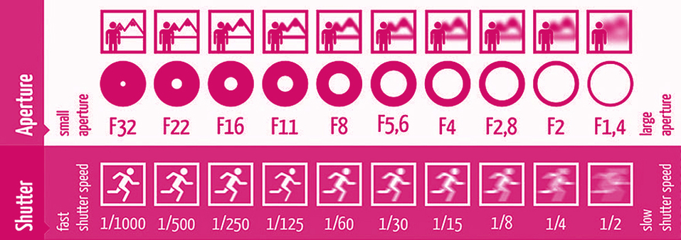
Adapted from this resource
When to say "Yes!"
Achieving the right balance between technical control, instinct, knowledge of the 'rules' and the confidence to break them is a matter of experience. Students today don't need to worry about the expense of developing films. They are able to shoot 100s of photographs in a single afternoon. Other skills then come into play. Which photographs have worked? Which are failures? Which are interesting failures? A thorough understanding of the structure of photographic images can help the student make sense of a potentially enormous body of work. Not all interesting photographs obey the 'rules' but knowing about them can help.
|
|
American photographer Henry Wessel is very articulate about the way photographs work. In this short film he describes his working process, one based on the craft of the darkroom, and describes the moment when the photographer says "Yes" with the click of the shutter.
It's very spiritual because you're suddenly seeing the coherence and the inter-connectedness of everything - left to right, top to bottom, front to back. It's all connected and somehow it's in this balance. |
At war with the obvious
Following the Second World War, some photographers began to question the prevailing rules about art photography: large cameras, big detailed prints, craftsmanship, fine grain, detail, formal beauty etc. Perhaps beginning with Robert Frank's book The Americans and William Klein's Life is Good and Good for You in New York, Trance Witness Revels ideas about what made great photographs were challenged. A generation of photographers across the world ripped up the rule book and redefined the medium of photography for their own age. William Eggleston is one such photographer who has profoundly influenced how we now feel about photography.
|
|
In the fantastic documentary The Colourful Mr Eggleston we discover the photographer's approach to composition. Inspired, like so many before him by the great Henri Cartier-Bresson and his book The Decisive Moment, Eggleston developed his own, idiosyncratic rules about making photographs - democratic, only ever taking one picture of one thing, experimenting with unusual framing, aiming the camera like a gun etc. Photography students are still entranced and puzzled by Eggleston's pictures, often left wondering why they are considered so reverently now. Eggleston absorbed the 'rules' so that he could play with them. In the process he challenged convention, elevated the status of the ordinary and generated new ways to capture bits of the world with a camera.
|
I am at war with the obvious.
-- William Eggleston
Breaking the 'rules'Rules are made to be broken. Yes, but not knowing the rules renders broken rules as just mistakes. Deliberately breaking the rules, getting things wrong, is a creative choice. Once the rules have been understood, they can be questioned and undermined. The author James Joyce famously eliminated the majority of full stops from the long last chapter of his novel Ulysses but not because he was unfamiliar with the conventions of sentence punctuation. Ivar Gravlejs has had some fun with creating instructions for photographers keen to avoid making obvious mistakes.
Here are some examples of photographers/artists who question some of the 'rules' associated with photography's relationship to the Formal and Visual Elements. In each case, a knowledge of the conventions or 'rules' has informed the photographer's creative choices and helps the viewer make some sense of the resulting pictures. Suggested activities:
|
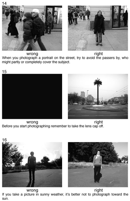
From Ivar Gravlejs' '78 Photography Rules'
|
I must admit that I am not a member of the ugly school. I have a great regard for certain notions of beauty even though to some it is an old fashioned idea. Some photographers think that by taking pictures of human misery, they are addressing a serious problem. I do not think that misery is more profound than happiness.
-- Saul Leiter
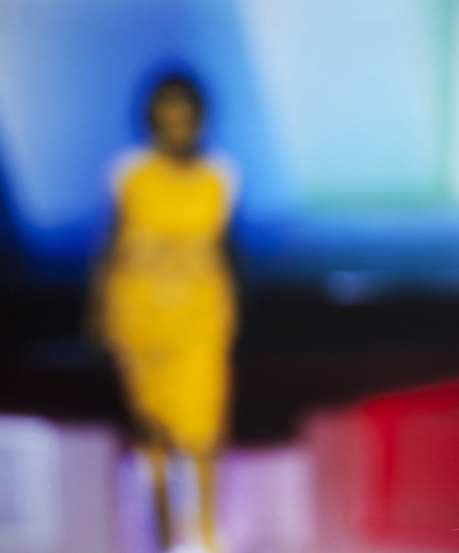
Bill Armstrong
Armstrong's practice involves re-photographing found images with the focus set to infinity. He is interested in the relationship between fact and fiction.

John BathoBatho's unusual compositions and framing draw attention to striking colour combinations which seem to be the real subject of his work.
|
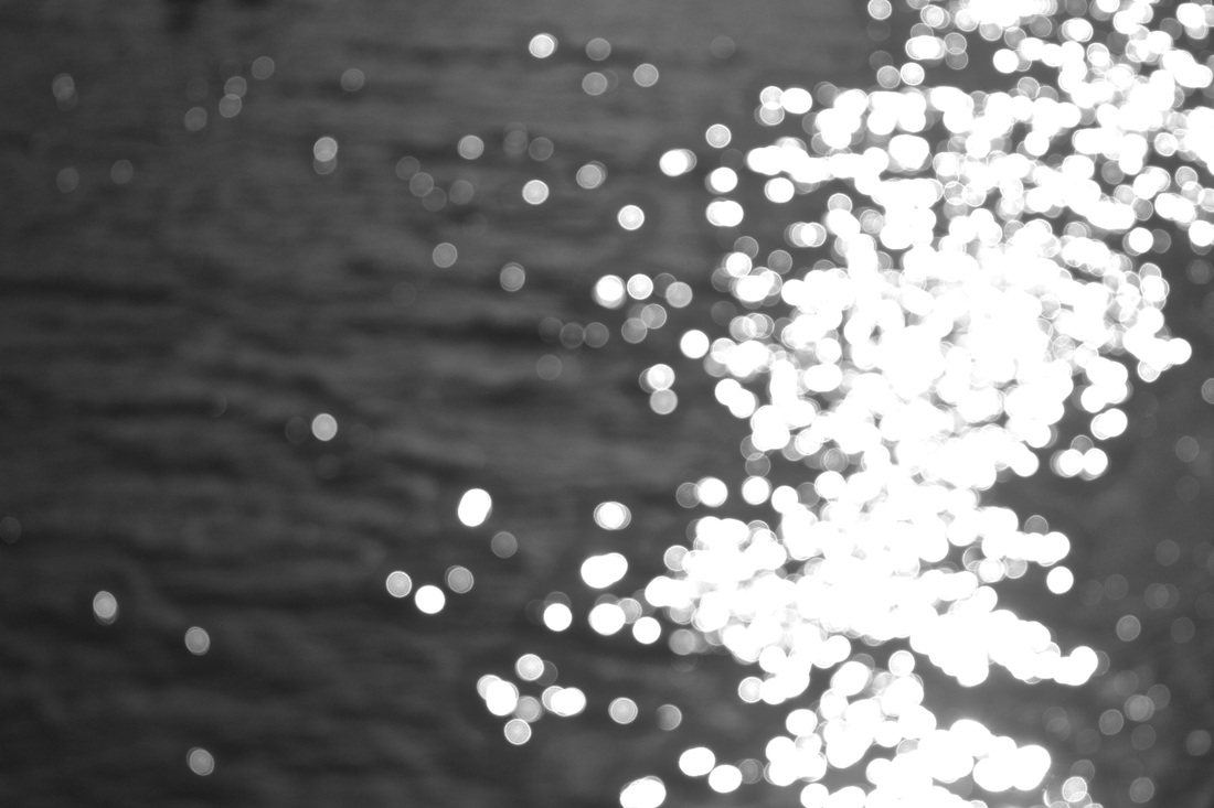
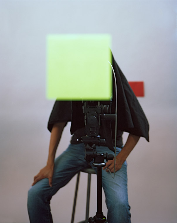
Uta BarthBarth is fascinated by light. She deliberately questions the traditional role of the camera and asks the viewer to reflect on the process of seeing.
|
|
|
|


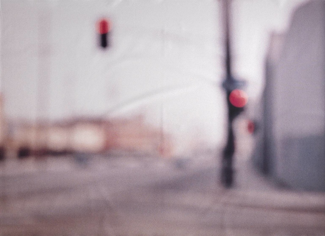
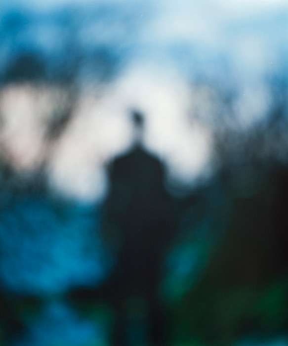
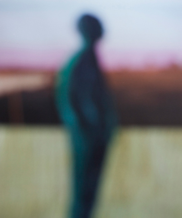
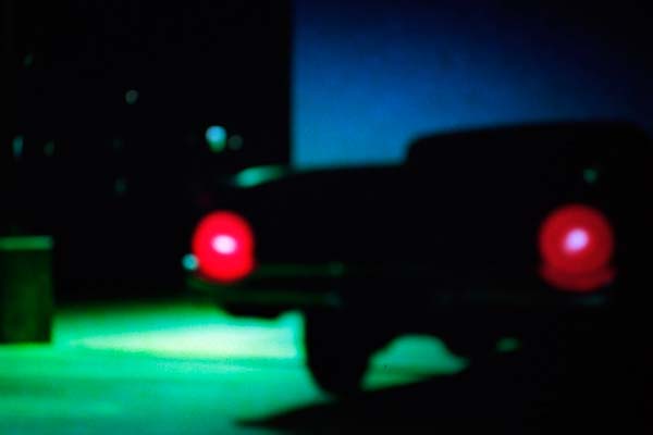
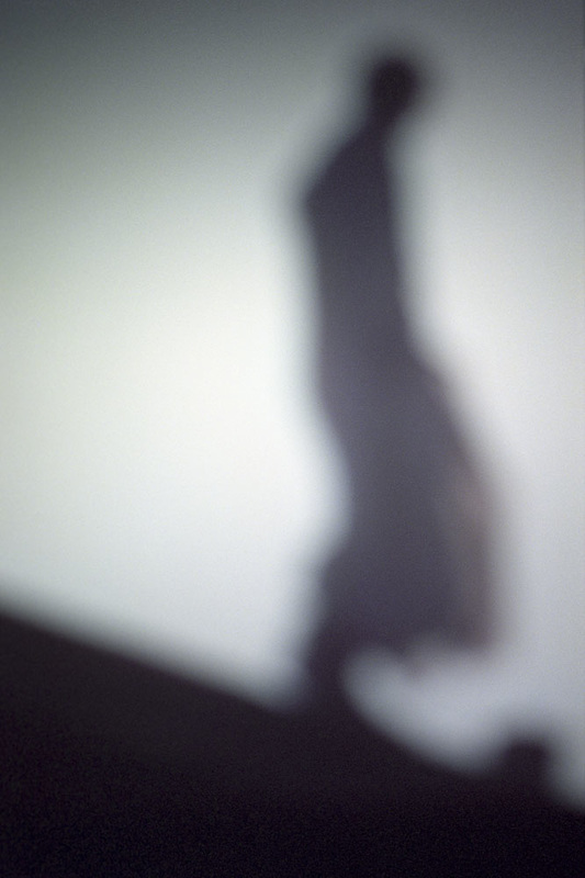
François FontaineFontaine's series Silenzio! Movie Memories presents out of focus photographs of scenes from films shot on film. They explore light, memory and fantasy.
|
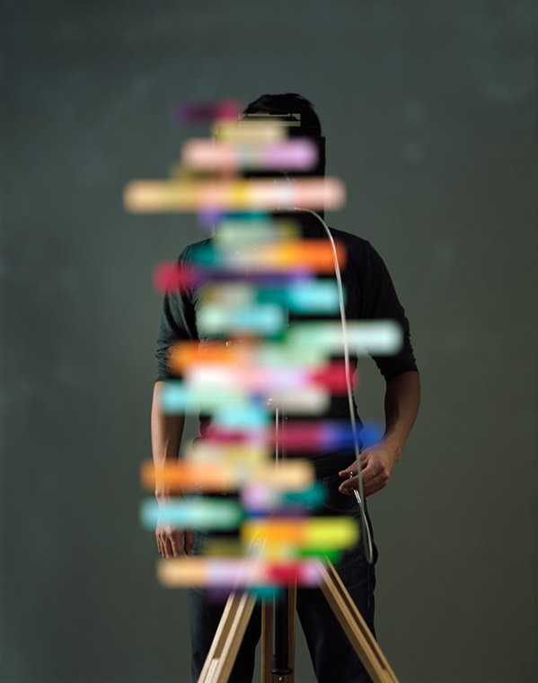
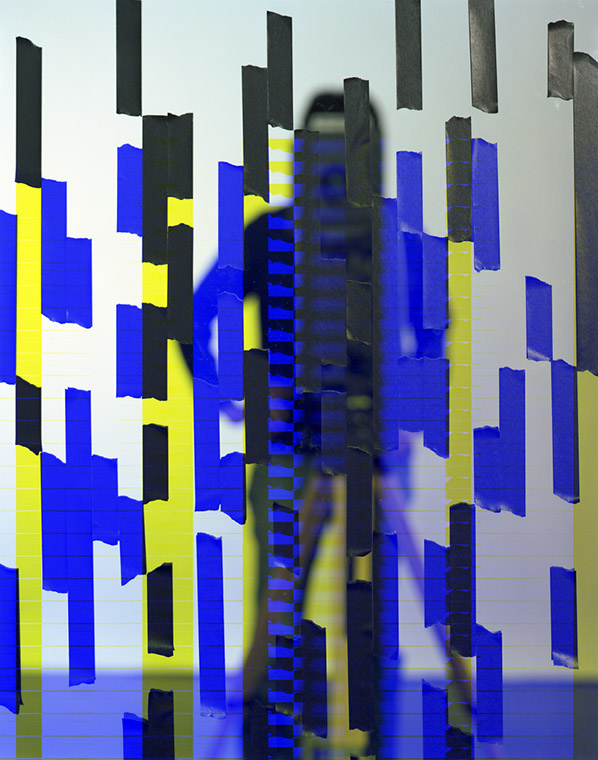
Akihiko MiyoshiMiyoshi questions our relationship to photographic images, a meeting of pigment and pixels, the intersection of art and technology.
|
|
|
|


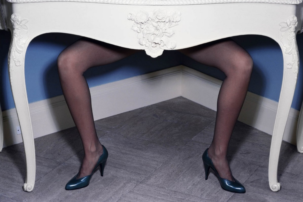
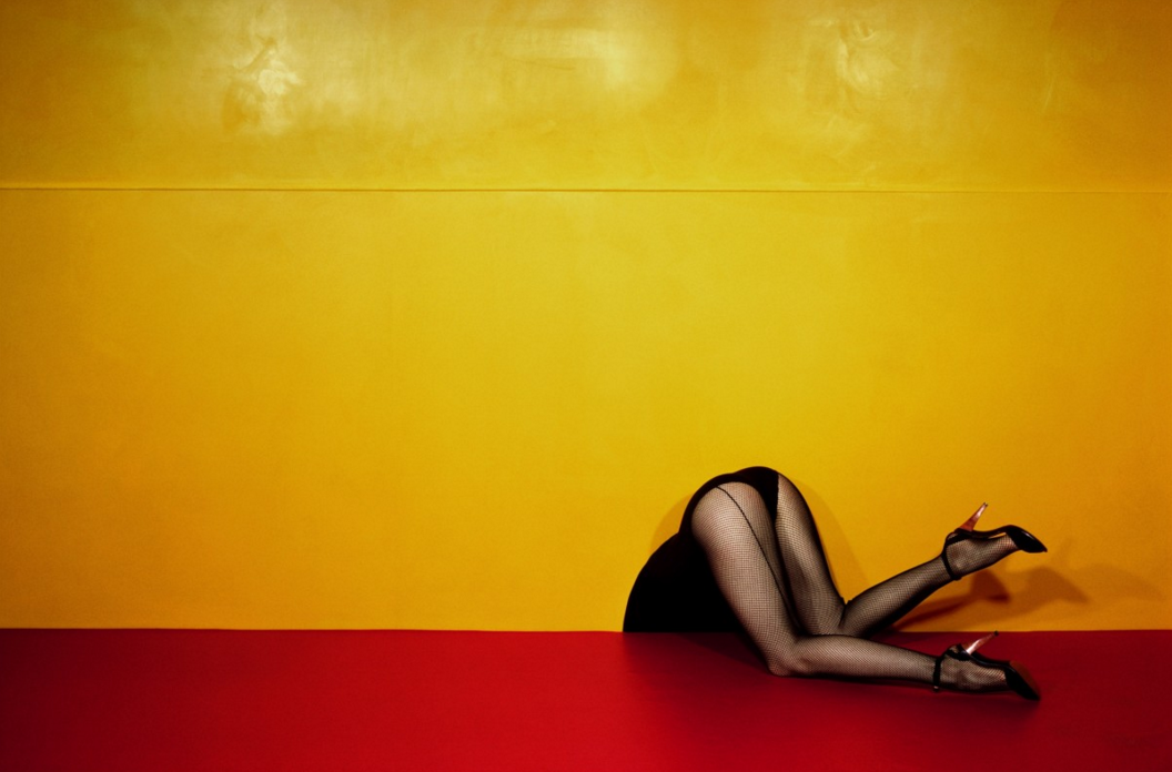
Guy BourdinBourdin's highly stylised fashion pictures were composed almost exclusively for the printed page. They are surprising, unsettling and captivating.
|
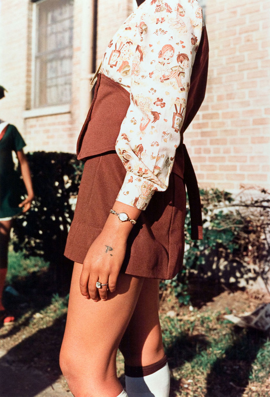
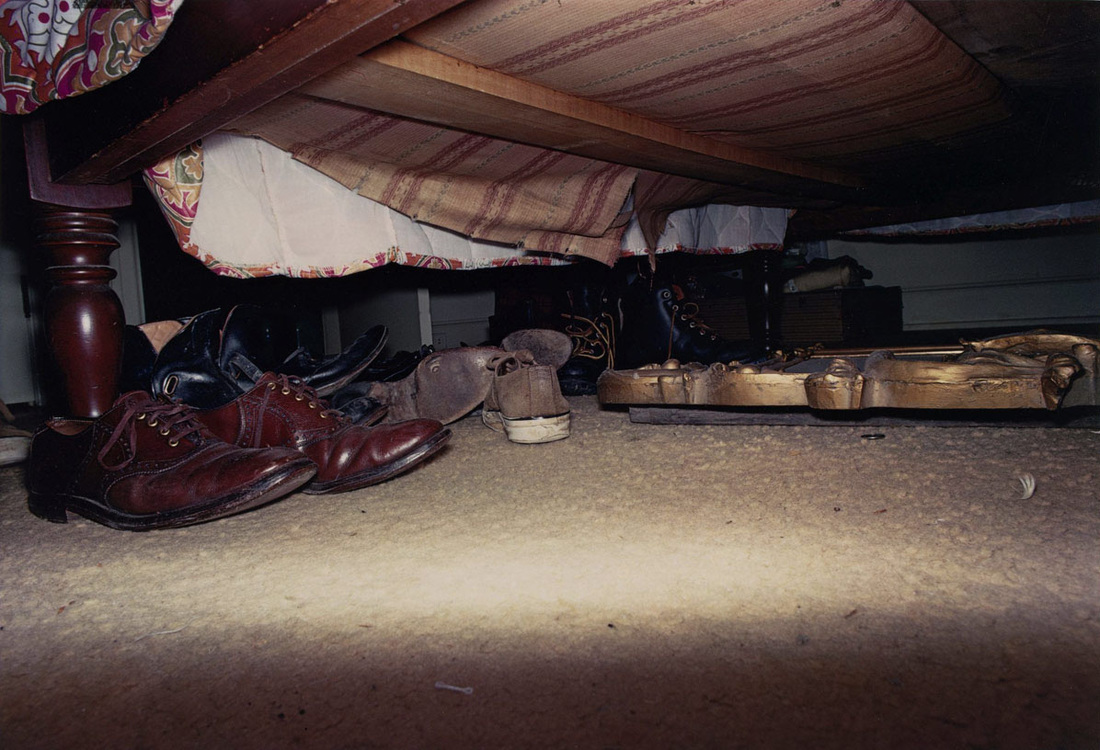
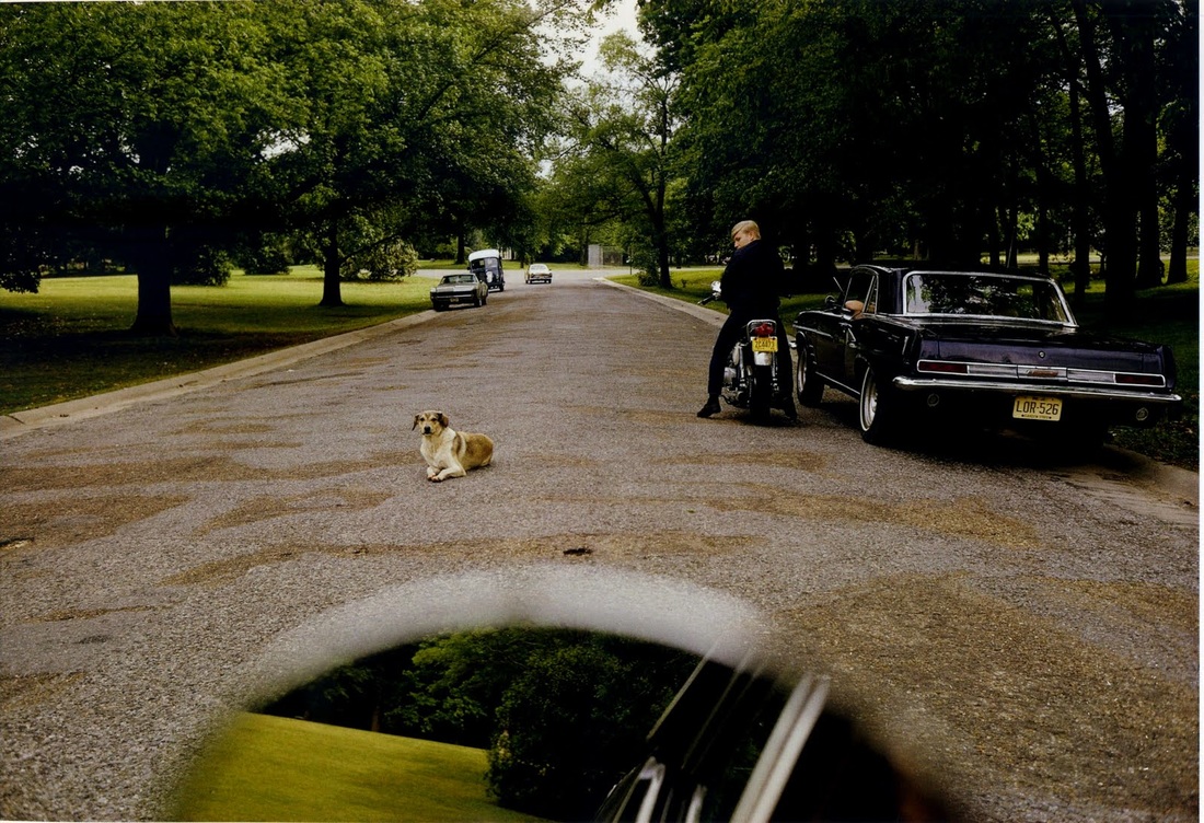
William EgglestonEggleston has had a huge impact on photography and its relationship to colour, form and the banal details of everyday life.
|
|
|
|


By Jon Nicholls