KS3/4 & Post 16 Lesson plan:
Combining letter forms and photographs
|
From Jon Nicholls, Thomas Tallis School
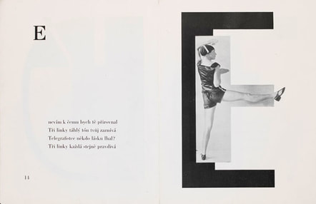
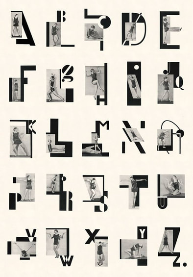
The inspiration for this project came from a book of postcards featuring photographs of the dancer Milca Mayerová, taken from 'ABECEDA: a jazz-age alphabet from Prague' by Karel Tiege originally published in 1926. The book was a response to poems by Vitezslav Nezval, each based on a letter of the alphabet.
I tried to create a typed image of a purely abstract and poetic nature, setting into a graphic poetry what Nezval set into verbal poetry in his verse. The magic signs of the alphabet. |
|
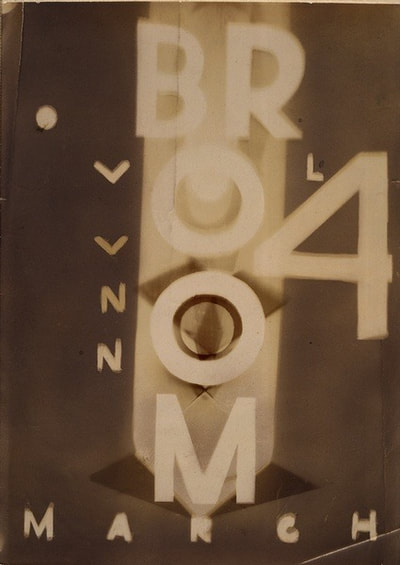
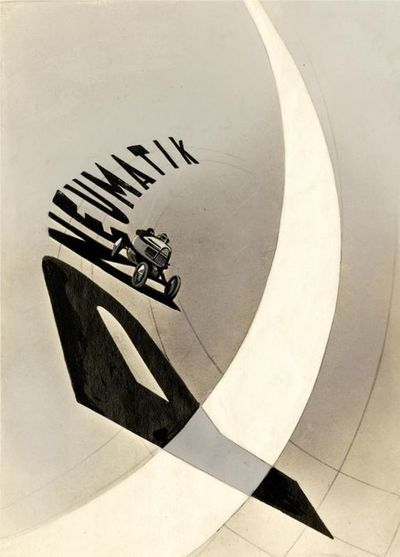
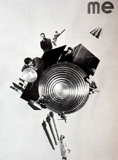
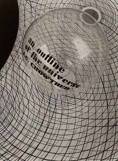
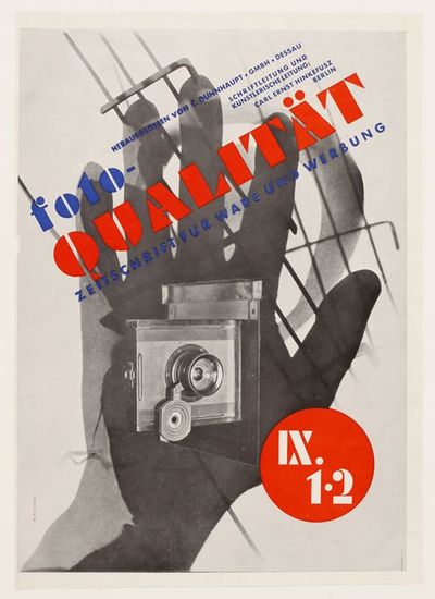
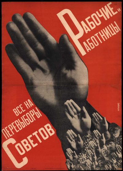
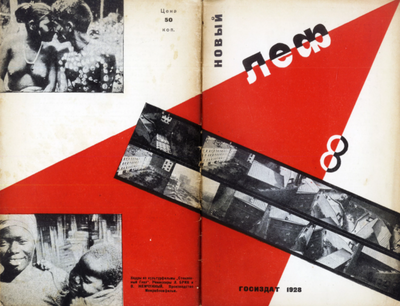
This film is a contemporary, animated re-working of the 1926 book design and was made for the exhibition, Dreams and Disillusion: Karel Teige and the Czech Avant-Garde. The combination of text and photographs was a feature of modernist art of the 1920s. Laszlo Moholy-Nagy, artist/designer and teacher at the influential Bauhaus, was fascinated by the potential of new technologies to transform the way we see and interpret the world. He was drawn to photography as the ultimate modern medium: photograms, photomontages, film, and the dynamic combination of text and photography that he named “typofoto.”
What is typophoto? |
|
This project encourages students to think about the visual language of photographs and letter forms. Both words and pictures are abstractions - special types of signs that help us read (and question) information. Experimenting with both of them is a way to draw attention to their abstractness and the various ways in which they can be combined and manipulated. Threshold Concept #5 might be most relevant: photographs are abstractions shaped by technology.
Some historical context
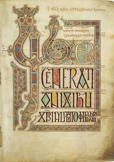
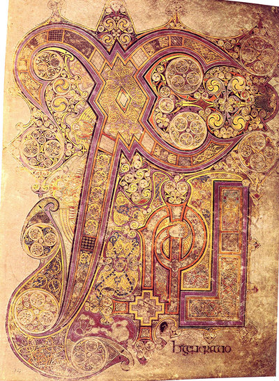
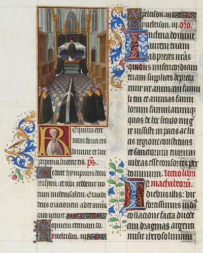
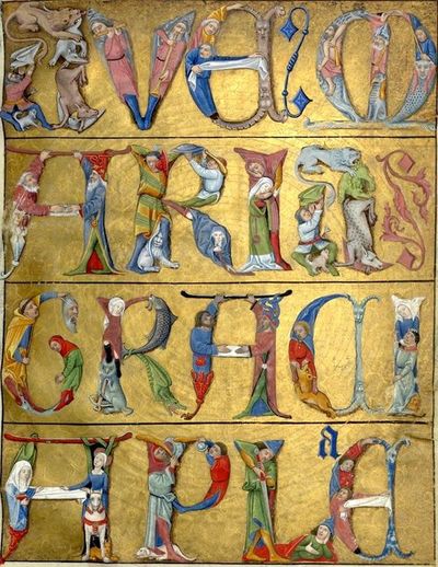
The idea of illustrating or decorating letters is not a modern one. The earliest examples of 'illuminated' letters come from the Eastern Roman Empire (400-600AD). By the Middle Ages, monks, working in monasteries as scribes, made elaborate, decorated copies of ancient and religious texts. By the 14th century, due to demand from private patrons, much of the production of illuminated manuscripts had become commercial.
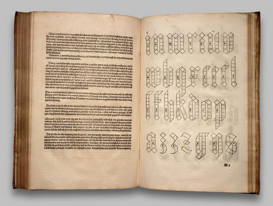
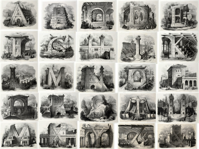
Gutenburg's invention of the printing press in the 15th century transformed typographic design. Artists and designers published theories of graphical communication. The intricacy and ambition of these printed designs is often breathtaking.
This stop motion animation tells the story of typographic history:
Artists and designers continued to create innovative combinations of typography and illustration, exploiting both the affordances of print technology and hand drawing, but the combination of photography and industrial design processes led early 20th century designers to create radical new experiments in visual communication. The main theorist of these new approaches was Laszlo Moholy-Nagy, especially during his time at The Bauhaus in Weimar and Dessau.
Photography is highly effective when used as typographical material. It may appear as illustration beside the words, or in the form of 'phototext' in place of the words [...] the typophoto governs the new tempo of the new visual literature.
-- Laszlo Moholy-Nagy
This short film guide to an exhibition at the Guggenheim Museum is a great introduction to the range of Moholy-Nagy's interests and achievements.
The illiterate of the future will be the person ignorant of the use of the camera as well as the pen.
-- Laszlo Moholy-Nagy
Here are a few examples of Moholy-Nagy's typophotographic experiments.
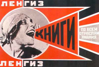
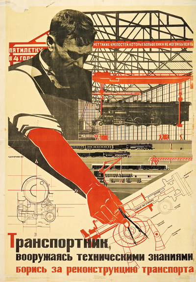
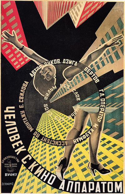
Other modernist artists, particularly those associated with Constructivism, experimented with the exciting new possibilities of combining typography and photography:
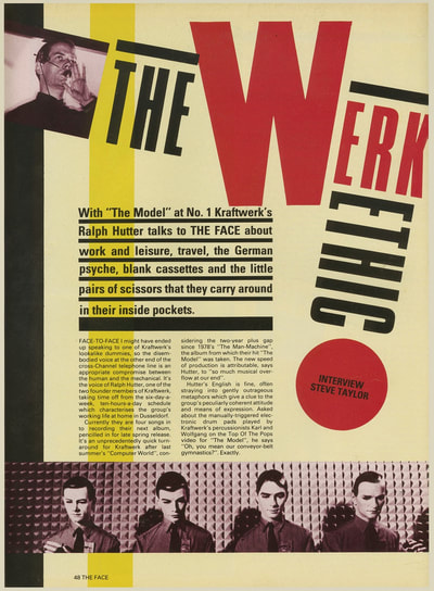
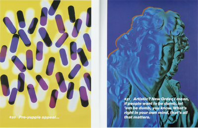
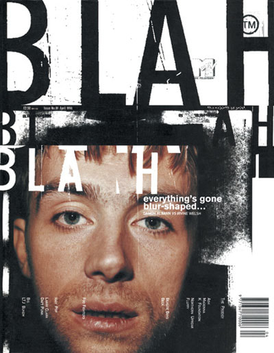
Contemporary artists and designers, like Neville Brody, Peter Saville and David Carson, have continued to develop innovative and influential responses to the typophoto concept.
Some suggested activities:
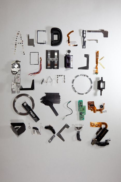
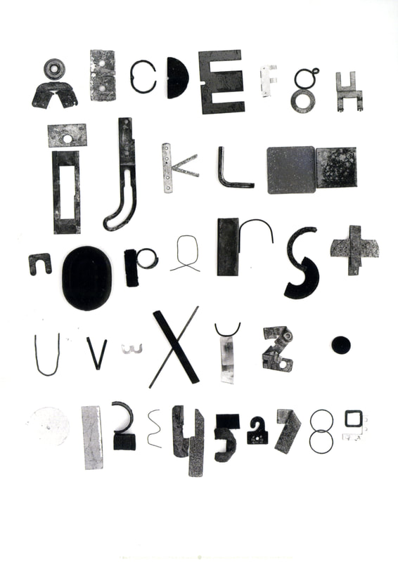
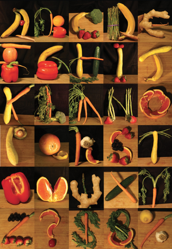
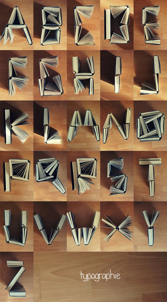
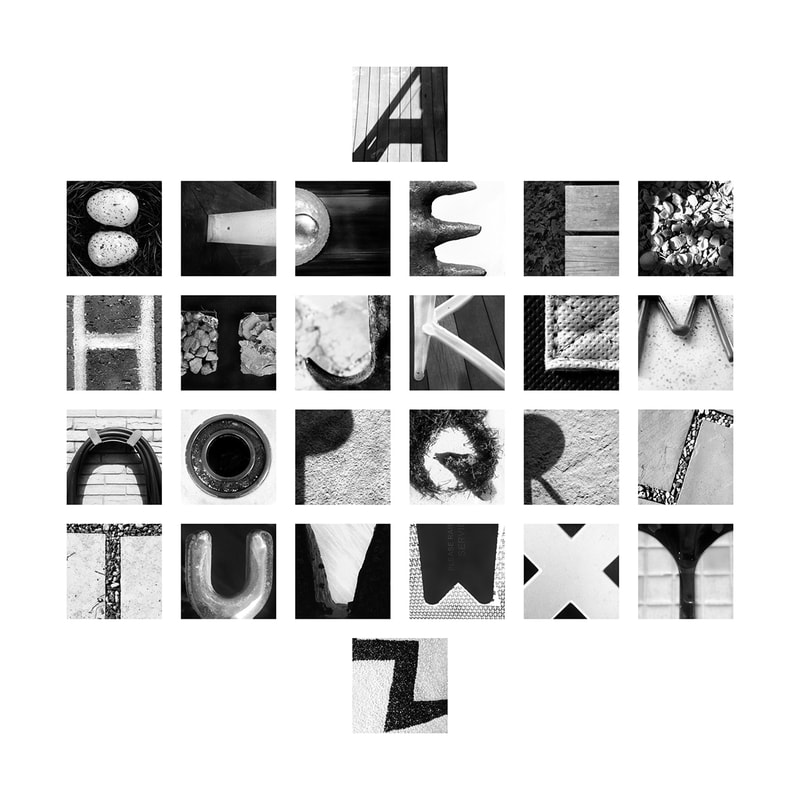
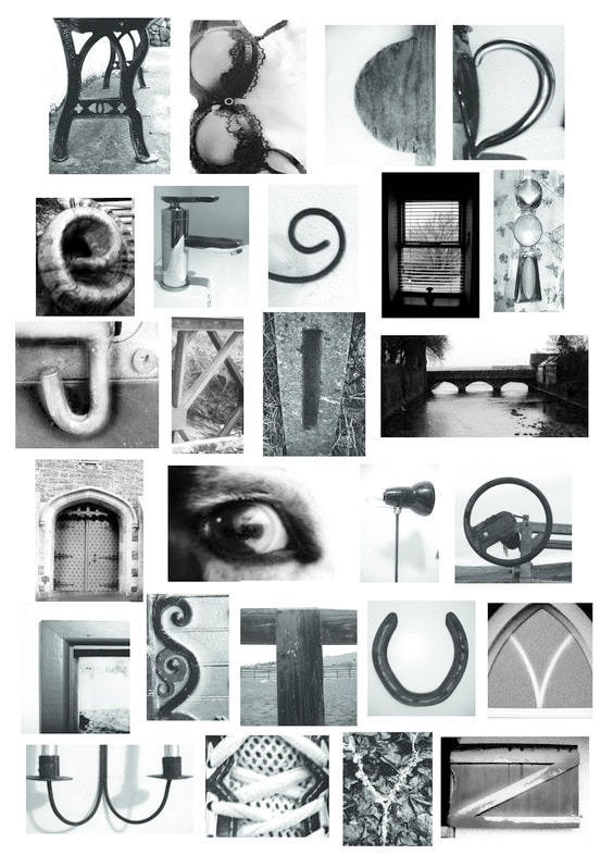
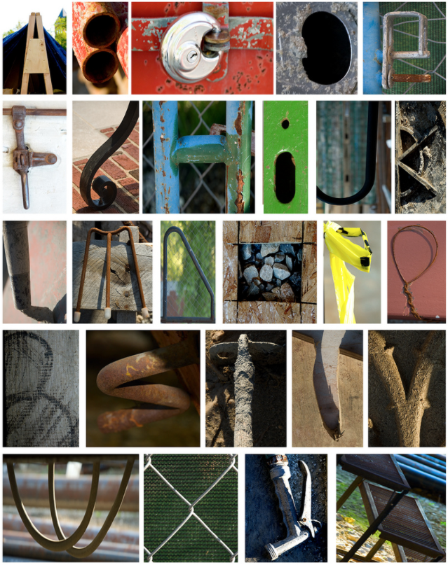
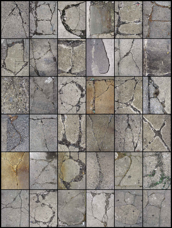
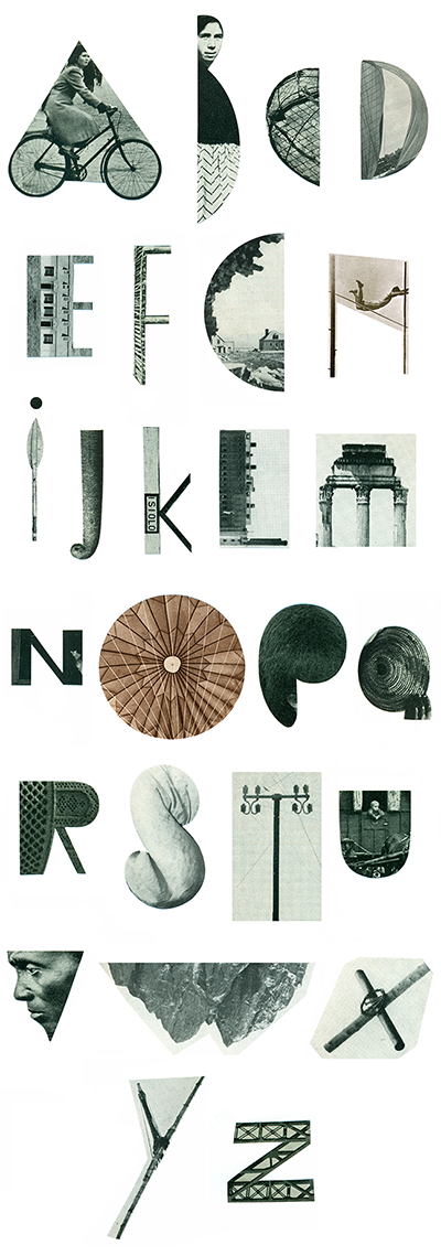
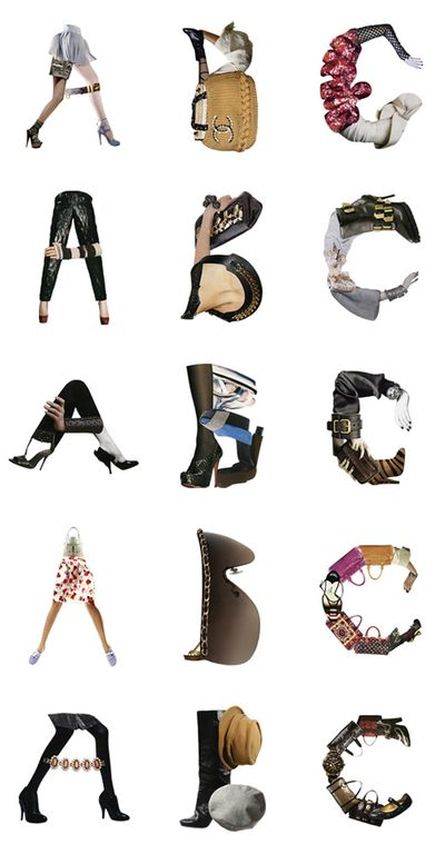
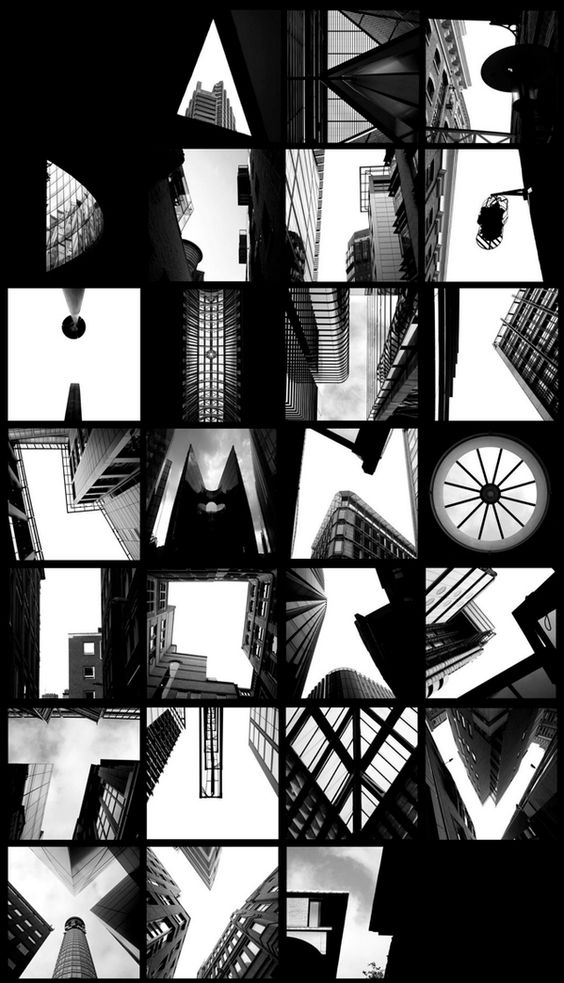
The following images are intended to inspire you to attempt to create various different kinds of typophoto alphabets. You could begin by trying to recreate one or more of the examples below. Or you may wish to begin inventing your own immediately. Remember to experiment with a range of image capturing devices - a camera, a scanner, a photocopier etc. Think about making photographs of individual letter forms as well as combining letters and photographs. Think carefully about composition and lighting. You could experiment with animating your letter forms.
For the purposes of documentation, remember to record the whole process of the creation of your alphabet(s), from initial research, design ideas, sketches and iterations through to the final high resolution versions. The problems you encounter, the failures and the solutions, are all part of your learning journey.
For the purposes of documentation, remember to record the whole process of the creation of your alphabet(s), from initial research, design ideas, sketches and iterations through to the final high resolution versions. The problems you encounter, the failures and the solutions, are all part of your learning journey.
An alphabet of objects:
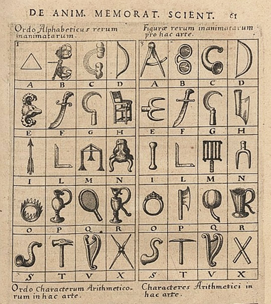
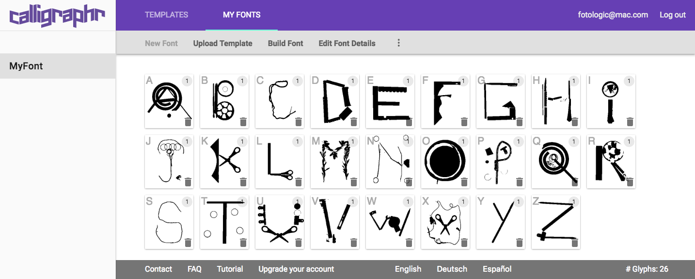
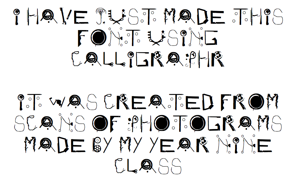
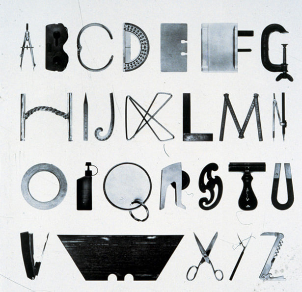
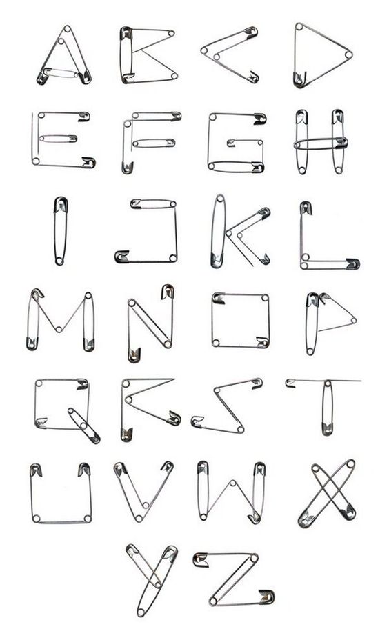
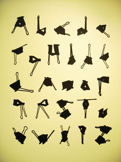
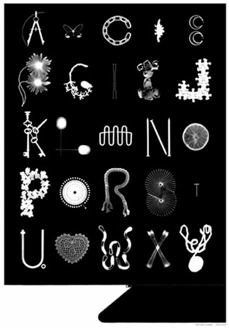
You could attempt to collect a series of objects that either already suggest letter forms or could be made to do so. Experiment with photographing and/or scanning the objects to create your alphabet. If you have access to a darkroom you could also have a go at creating a photogram alphabet. No darkroom? Try experimenting with both positive and negative versions of your alphabets. Check out the Calligraphr site. This enables you to create your own font. It's really easy. Here's an example of a font I created called Photogram:
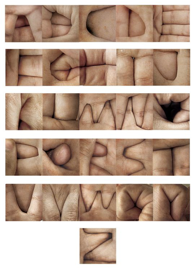
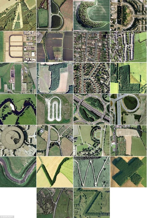
A found alphabet:
Threshold Concepts #4 and #8 are relevant here. Finding letters in the real world relies on your ability to select details and frame your subject, paying attention to the edge of the picture and the forms it contains. Letter forms can also be found in existing imagery. Look carefully at the pictures in magazines and newspapers. Explore ways to frame and isolate certain details, revealing hidden letters.
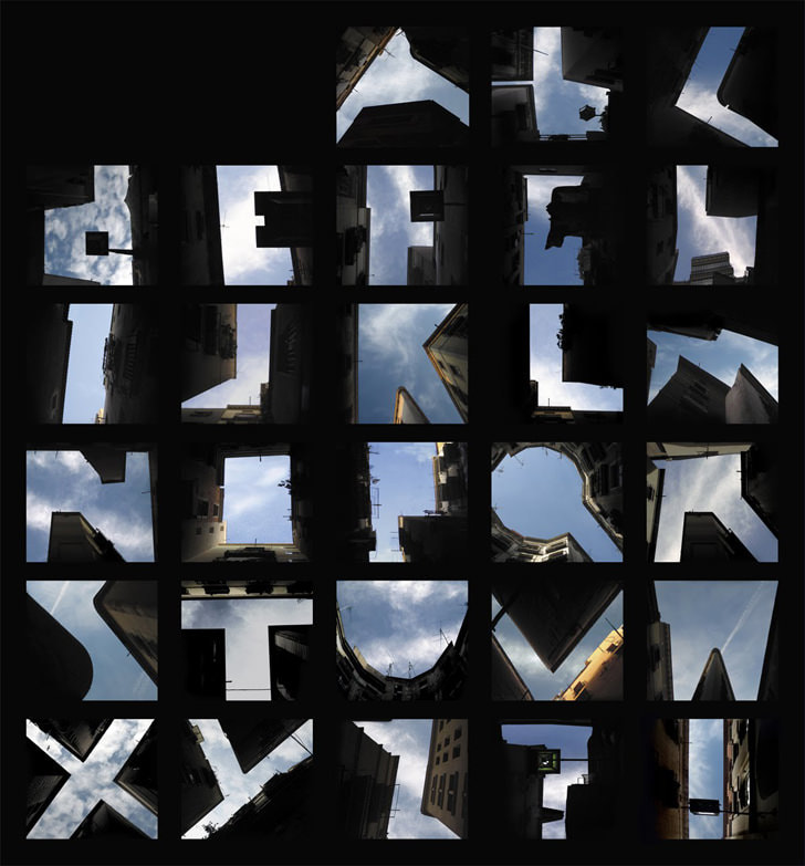
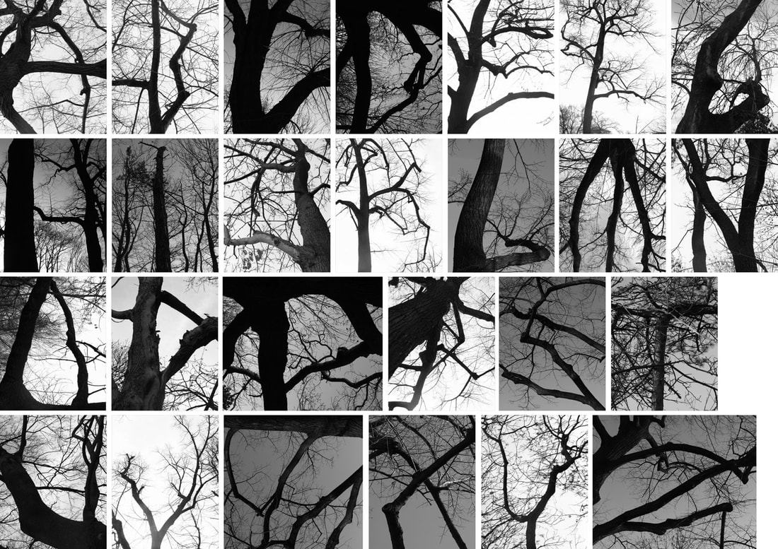
Sky type
Typography relies on a balance between positive and negative space. Whether its the forms of buildings or tree branches silhouetted against the sky, a carefully framed photograph can create the illusion of a letter form. Pretty soon , you could collect a whole alphabet...
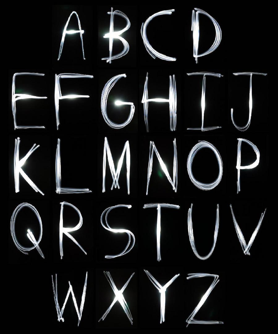
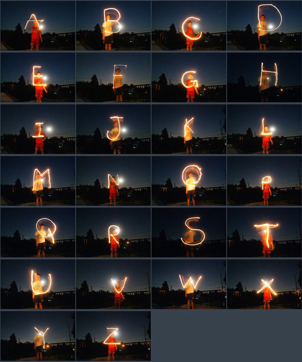
Light painting alphabet
Painting with light is great fun because its a collaborative way of getting to grips with the manual settings on your camera. Balancing shutter speed, aperture and ISO settings takes practice - almost as much practice as learning to write letter back to front.
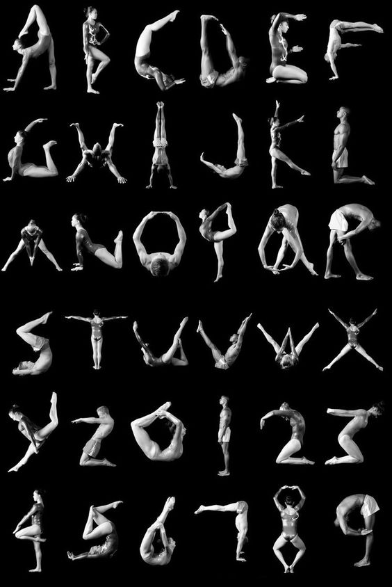
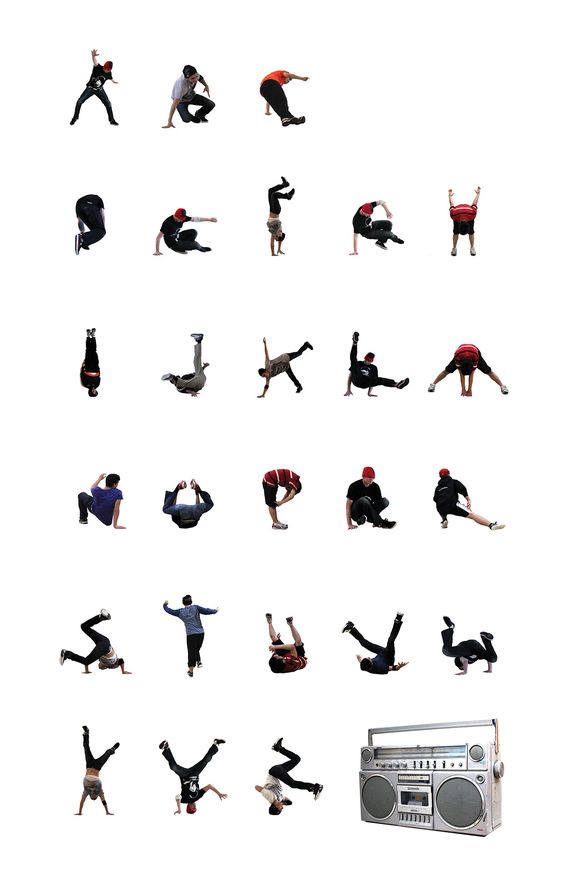
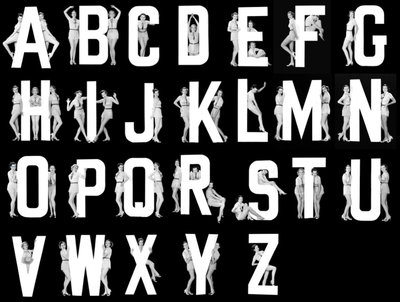
A dancer's alphabet
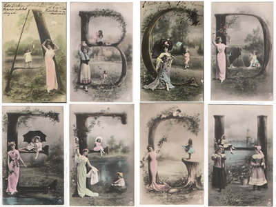
Remember Karel Tiege's 1926 alphabet book that inspired this project? These examples are inspired by the amazing elasticity of the human form. If you have some dancer friends, this could be a really interesting collaboration....
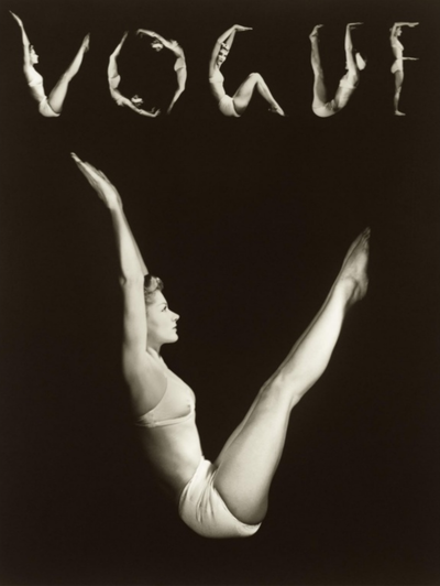
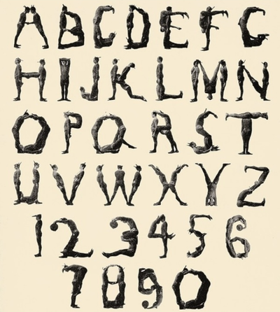
Body type
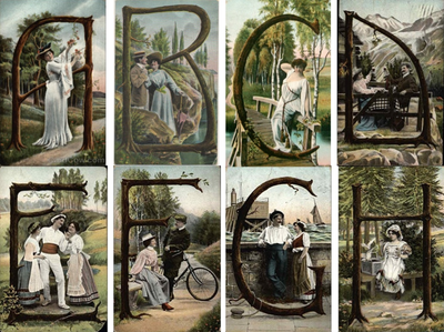
Here are some more examples of the human body being used by designers as a template for (or accompaniment to) letter forms.
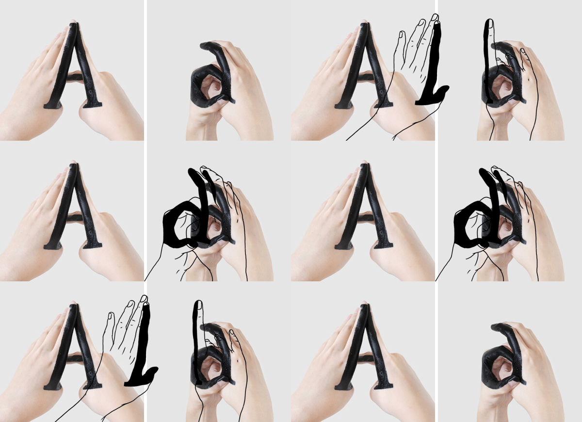
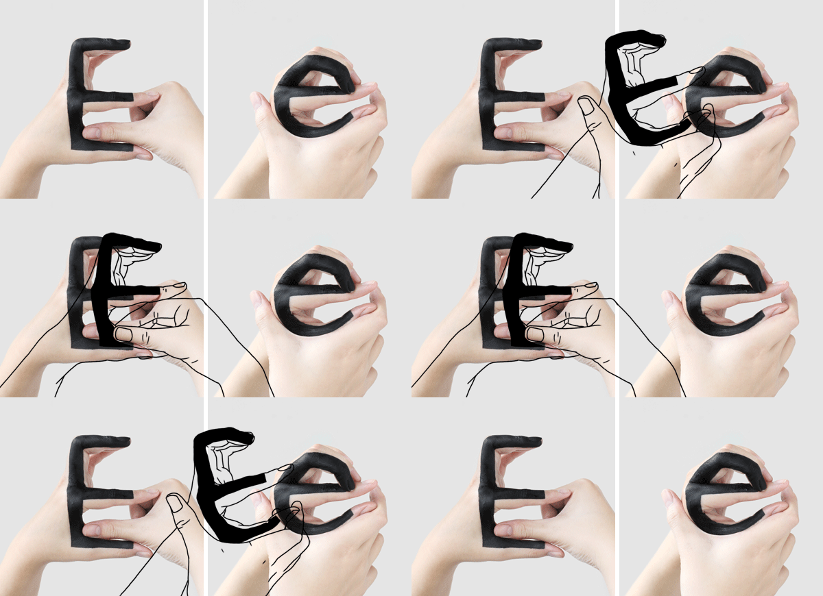
Hand type
Given that an entire communications system has been invented using only the human hand, it's no surprise that some designers have exploited its flexibility to create handmade alphabets. The first example by Tien-Min Liao is a fantastic example of an upper and lower case hand alphabet (with a brilliant accompanying animation to explain the process).
Handmade type by Tien-Min Liao.
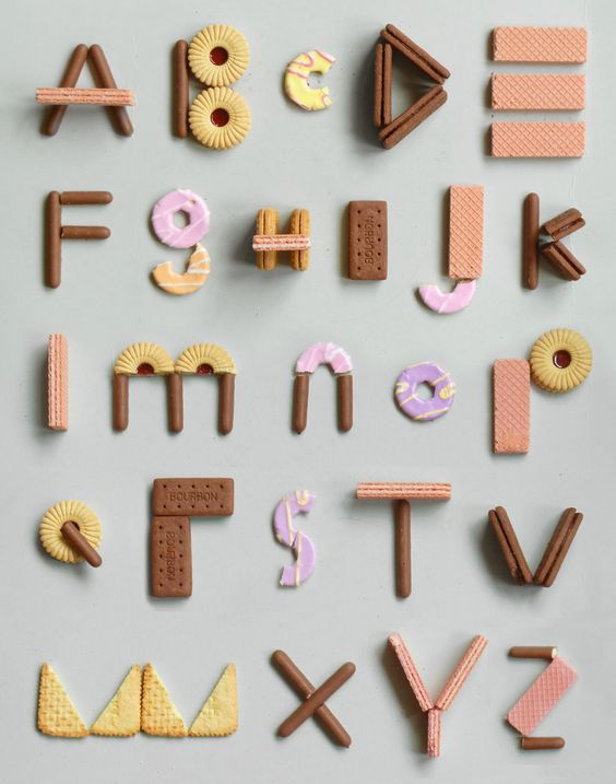
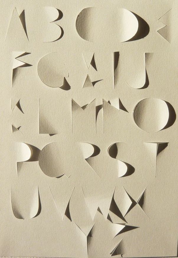
A crafty alphabet
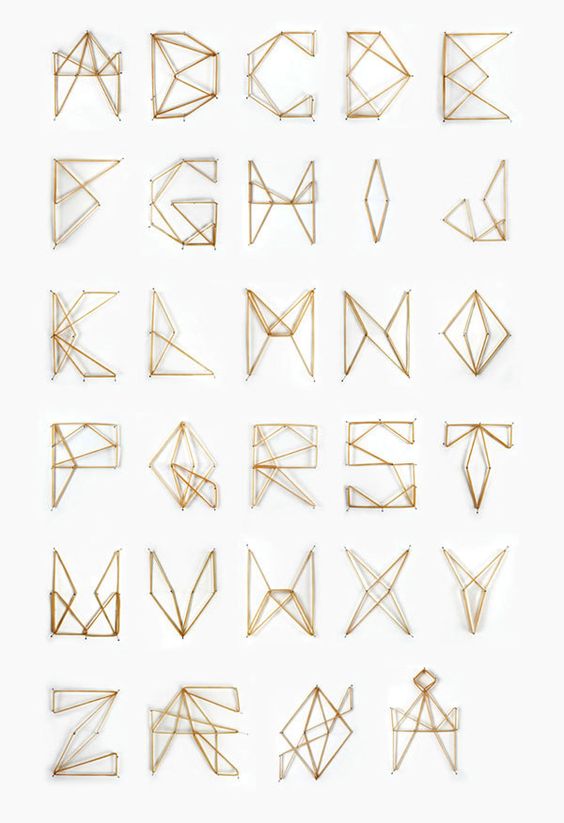
Sometimes it's necessary to create the letters for your alphabet before you can photograph them. These examples demonstrate various inventive strategies for crafting letter forms:
Surreal alphabets
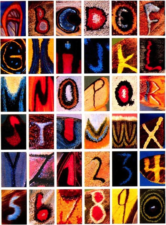
Here are a couple of examples of alphabets drawn from really unlikely sources.
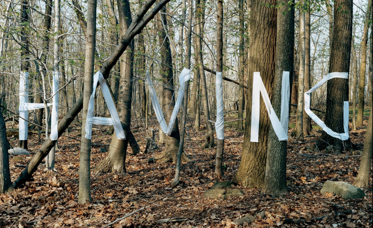
Typophoto installations
Designer Stefan Sagmeister is famous for creating messages using three dimensional typographic installations. Photographs of these temporary installations are all that remain. You could experiment with creating messages using your new typophoto alphabets or experiment with a Sagmeister inspired installation.
