| One of the great pleasures of photography for me is the editing process. I don't mean the tweaking in Photoshop but the process of selecting, ordering and arranging a sequence of images so that they add up to more than the sum of their parts. Once I have a set of images in front of me (either physically or arranged in a digital folder somewhere) I begin moving them around, arranging them in piles and considering my options. Depending on the nature of the imagery, this can achieved using various strategies. For example:
|
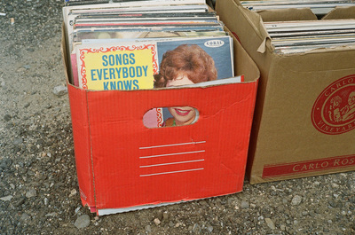
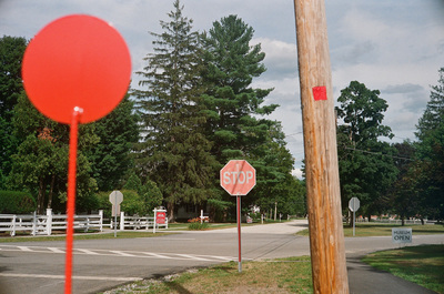
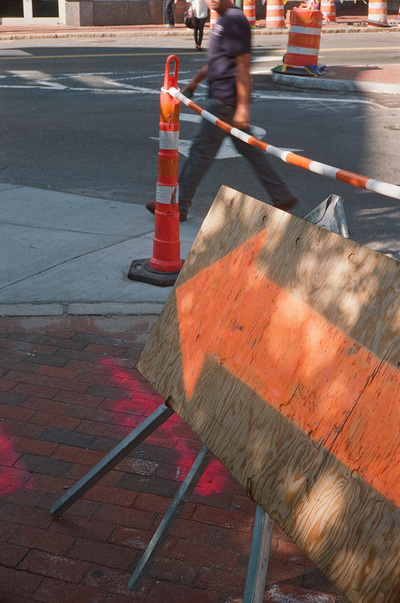
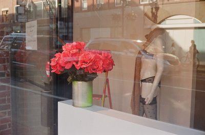
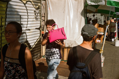
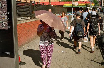
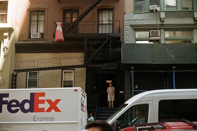
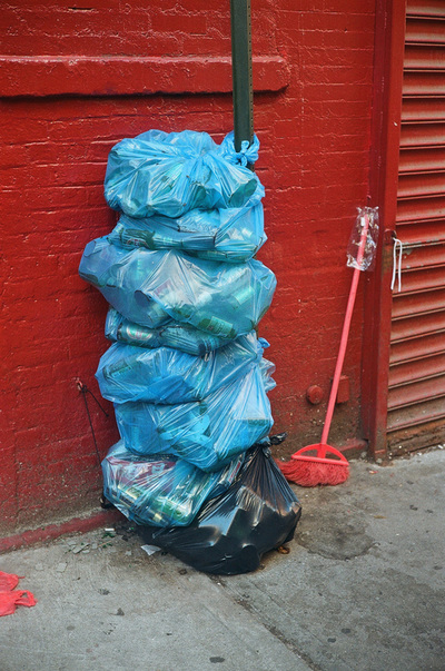
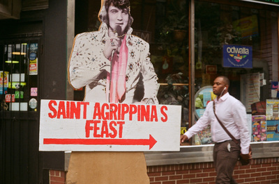
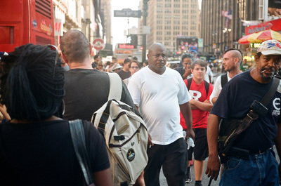
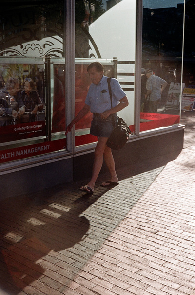
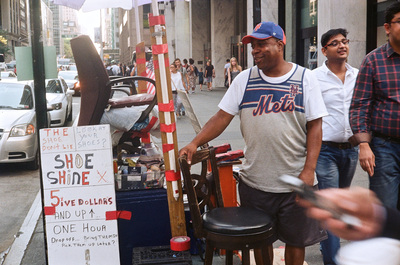
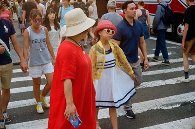
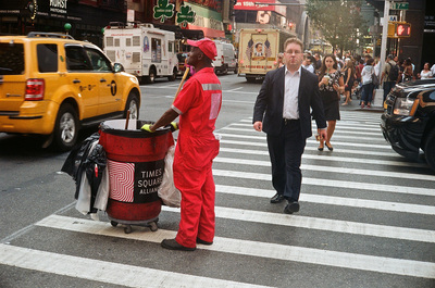
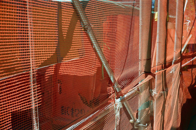
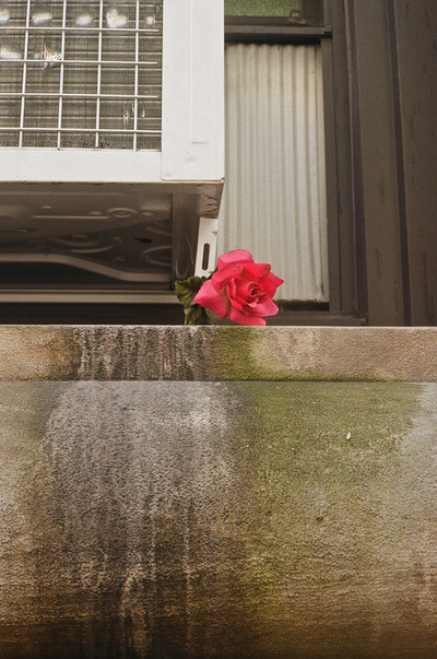
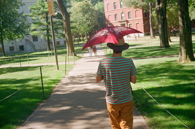
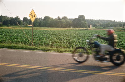
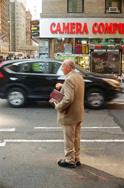
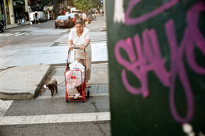
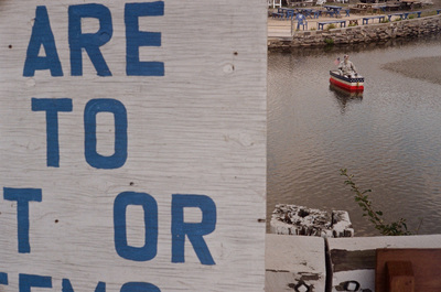
Here, for example is a sequence of images connected by colour - in this case, red. When I used to shoot exclusively with Kodachrome 64 transparency film (now sadly unavailable) it was always the reds that seemed most vivid in the resulting slides. Perhaps I'm still subconsciously drawn to red when I make photographs, although it could also be argued that so are advertisers and shop window display artists and sign designers and others who create our visual landscape, precisely because red is so seductive, leaping out at you and grabbing your attention. Perhaps one of the most famous red photographs ever made is William Eggleston's fly's eye view of his friend's ceiling. As Eggleston himself observed:
The photograph was like a Bach exercise for me because I knew that red was the most difficult colour to work with. A little red is usually enough, but to work with an entire surface was a challenge. It was hard to do. I don't know of any totally red pictures, except in advertising.
-- Jon Nicholls



 RSS Feed